Hi & welcome to my PS blog! This blog is for full PS although some steps will also work in PSE. Most actions, unless stated are not PSE compatiable. I do try to make an action for PSE from time to time. I hope you have fun here and learn some things along the way. If you have any questions, just drop me a comment! :O)

Wednesday, May 27, 2009

A couple more quick lightening and darkening tips...

Well, it's Wednesday and I'd normally be doing an action set review, but since I still can't load my calibrator, I cannot do the action review yet. I'm taking my laptop in tomorrow to the shop. The good news is with my 2 year extended warranty, I get a loaner laptop if they can't fix it in one day, which I doubt they'll be able too! So atleast I won't be without and I'm hoping that I'll be able to load PS and calibrate it while I have it, so I can still get some stuff done.

So as a filler post this week I wanted to further go over a couple of other * beginner * tips on how to lighten or darken your photos. This will be a short post and really easy. But I just HAD to post SOMETHING! Ha!
And since I've already gone over how to lighten with a curves adjustment layer, I thought I'd go over a couple of other options that may work for you. Remember, every shot needs something different, so try your hand at all of them and see which fits you and your shots the best!

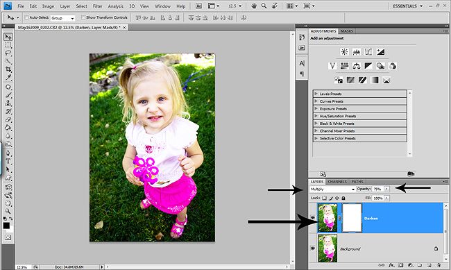
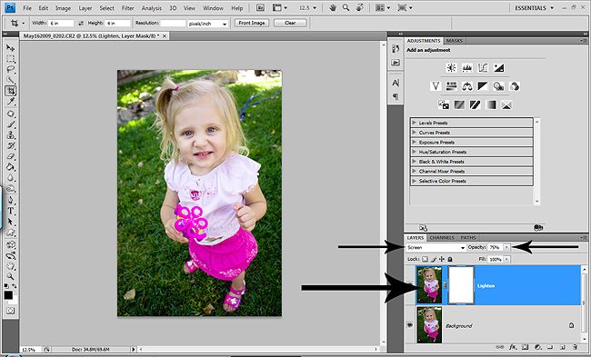
So probably one of the most popular ways to lighten or darken a shot is done with duplicating the photo layer and changing the blend modes. To lighten you would choose screen blend mode and then play with the opacity of the top photo layer and you can always add a layer mask and do some masking if needed. And to darken a shot, instead of using Screen as your blend mode, you would choose Multiply. This is a great method and can be very successful at saving shots that didn't turn out right SOOC, or you want a different affect. The drawback with this method is it makes your file sizes larger.

Here are a screen shots of the Screen & Multiply blend modes. I didn't do before/after pics because I can't tell the colors without my calibrator. So for now, it's screenshots only!

This shot SOOC was underexposed. I upped the exposure a tad in ACR, but not too much so I could show you the duplicate photo screen method.


Before I go any further, I do understand that the shot in this screenshot looks lighter than the one above, but this is because I purposely ligthen the pic A LOT to be able to do the duplicate photo layer with Multiply blend mode. So don't look too much at these quick examples, just the technique themeselves and try them out.

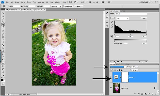
Now, as I said, the above technique is great and works when you need a LOT of help with making your shots lighter or darker. But what if you don't want larger file sizes or don't need THAT much help? Here is a really QUICK way that will keep your file sizes a bit smaller and the way I do my basic brighten or darken the whole pic.
Chose a levels or curves adjustment layer. But don't make any changes. Just hit okay, or if you are using CS4, just click on the levels or curves adjustment layer. Now to lighten, just change the blend mode of the adjustment layer to screen and VIOLA, a nice subtle ligthening!

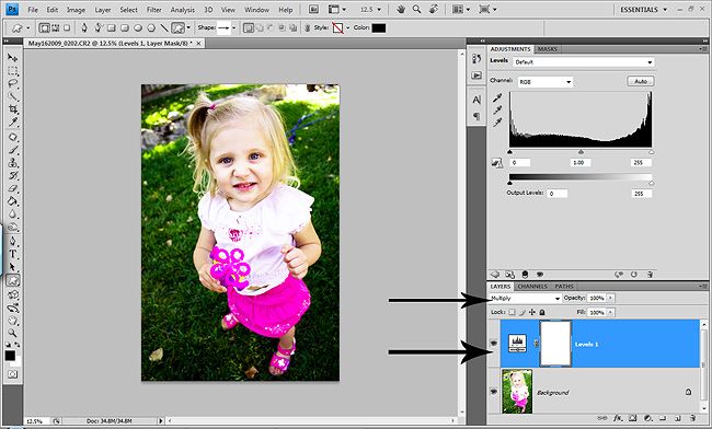
And to darken a pic, same steps, curves or levels adjustment layer and change the blend mode to Multiply. And as with any layer, always play with the opacity of the layer if needed and also as always, add a mask if you need to mask stuff in or out!

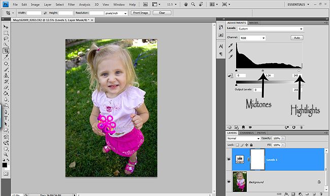
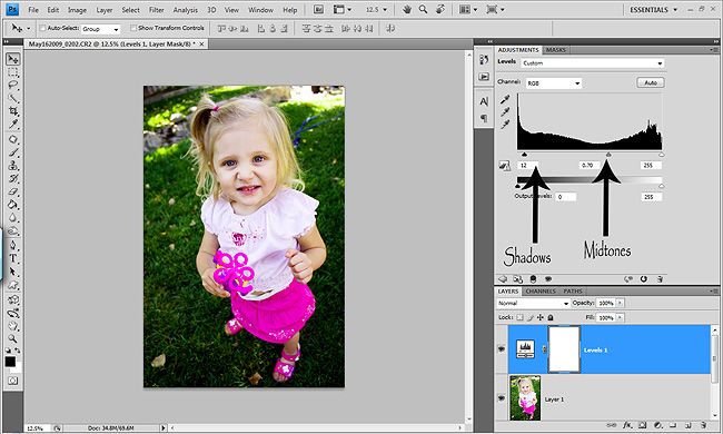
Now if you want a little more control and have a couple more seconds, you can lighten your photo with a levels adjustment layer as well. Just take the top middle slider (midtones) and slide it to the left a bit which will lighten all the midtones in your shot. Then take the top right slider (highlights) and give it a gentle boost to the left to give your highlights a little pop. Now you are lightening certain parts of your photos, without washing out the shadows! YAY!

And to darken using the levels adjustment layer, just take the top left slider (shadows) and nudge it to the right a tad deeping the shadows in your shots. Then take that midtones slider and bring it to the left a bit to bring down your midtones. Unfort you cannot bring down your highlights with the levels adjustment layer. I won't go into setting your target points YET. That's for another post!
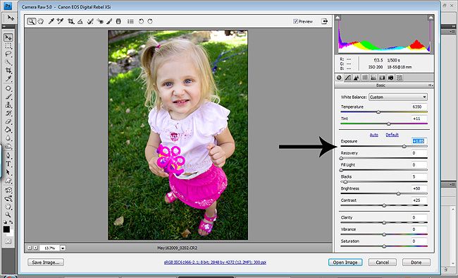
And for those of you who shoot in RAW (which I HIGHLY recommend if you don't or atleast TRY it) you have a lot of control to lighten and darken your shots in ACR. This shot was the first I took and I just snapped it quickly without checking my light meter. DUH! Ha! So for this tut, I'm just showing you how I lightened it. I'll post another full ACR tut on how I use ACR another day.
So all I did was take the Exposure slider and slide it to the right, which lightened my whole shot. It's ALMOST like being able to change your settings after the fact. You can do a good amount if you shoot in RAW without loosing too much quality in your shots in ACR. I shoot in RAW 100% of the time.
When using the Exposure slider, you can hold down your alt key (PC) and it will turn your screen black so you can see if you have any clipping. Again, I'll go over that and all of the other sliders and some other stuff in another post. As you can see in my screenshot, I had to up it quite a bit to lighten the shot. And if it had been overexposed, I would've taken the Exposure slider and slid it to the left a bit.

And there you have it, a couple other options for lightening and darkening your photos. One of the things I love about PS so much is that there are SO many ways to do one thing. It's nice to have a lot of different options, so that you can find the best option for you and your shot(s). So try these out and make notes in a notepad. And before you know it, you'll have the basics of PS and you'll be editing like crazy
Hopefully Friday or next week I'll be posting a fairly in depth tut on layer masks and how they work and how to get the most out of them. If you don't know how to use them yet, make sure to check back because once you start using them, you won't know how you ever edited without them! Then the ACR tut!
I hope everyone had a wonderful Memorial weekend and once all my laptop stuff is worked out, I'll be posting lots of fun new posts!
Have a great rest of your week!

Friday, May 22, 2009

Sharing one of my action sets...

Hi ladies! I hope you girls are all having a great week! Wish I could say mine has been great. Looks like that computer will be going to the Dr next week. We are leaving tonight for the holiday weekend, so I'll be calling on Tuesday to find out the details. But I wanted to get my action set up to share before I leave and before I am without my baby! I'm sure it'll be gone for a couple weeks. I'm going to have my husband hook up the net on the desktop, but it's in our detached garage. So with two kids, I'm sure you know what that means. So please keep coming by and checking for updates tho. I'll calibrate the desktop so I can still play, just won't be as often.

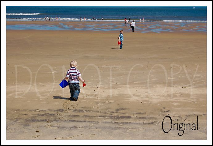
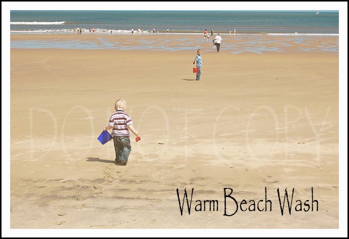
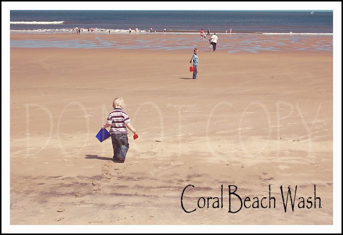
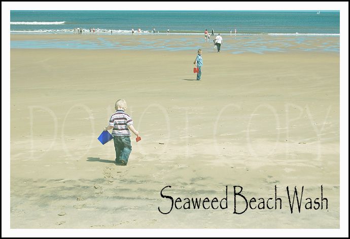
So here is my favorite creative actions set I've recorded so far. I love a creative edit and this set is great for the beach or outside shots. The great thing is every layer is adjustable and all layers have a white layer mask for painting. Each action in the set is grouped in a folder and the folder also has a white layer mask. So you can just paint or lower the opacity of the whole folder, or you can adjust by layer.

I really hope you like them! I would love to hear what you think of them after you've had time to play and I'm always open to suggestions how you think my actions can be better.

The examples shown were done on my NON calibrated laptop because my computer decided it didn't like my calibrator anymore and won't let me reload it! UGH. So bear with me. The examples have been slightly adjusted. They are pretty strong run as is, but on the right photo will work! And you can lower the opacity of all the layers for a subtle creative look as well.
Thank you Gemma for the GREAT beach shot to use for my examples. Haven't been to the beach this year. Sad when you live in So Cal! Ha!


I've never used 4shared before so hopefully everything will work without any problems.
I also have a b&w conversion set, an eye pop action set and a color pop action set I'll be sharing in the future as well.
I hope everyone has a GREAT & SAFE holiday weekend!

Tuesday, May 19, 2009

Having some computer problems...

or as my 2 year old would say "puta"! Lol! UGH...annoying in general and more annoying since I just started this blog and am so excited about it. I was going to post Monday about Layer Masks, but have been having the issues. I hope to post a free "Day at the beach" action set that I recorded tomorrow. But we'll see how my PUTA is behaving! Ha! I most likely will have to send it in! :O( Only had it a year and 3 months...granted it's on all day every day!

So please bare with me and know that I haven't abandoned the blog. Check tomorrow as I hope to get my action set up (which is the only action set I'm really excited about) and if I can't get mine up tomorrow, I'll at least go over an action set I already have with some examples.

Hopefully my PUTA won't be gone for too long because I may have a stroke if I'm without it for too long. I can't even edit any shots now because the problems are creating problems with my Spyder3Pro calibrator and I'm on a laptop. So I won't dare touch a pic without it!

Thanks for your patience girls and I promise I'll keep the blog going until I send it in and will jump right back in when I get it back. I will keep you updated on when it's going to the PUTA shop etc!

You girls are GREAT and I deeply appreciate your support!

Friday, May 15, 2009

Let's talk BASICS...

Let’s talk Basics…this will be long…get used to it! I’m LONG winded!

Photoshop can be very intimidating and overwhelming. I remember when I first started PSP9 making sigs, which also works in layers, I was lost. And with a LOT of help, I found my way.

Then when I started trying to learn photo editing I remembered thinking…”What the heck am I supposed to do?” I had no idea what layers did what, which ones to use and why.

So I wanted to go over two very basic layers that I do on every photo. These two layers will hopefully serve as a starting off point and give you a basic understanding of how each layer works so you can adjust them to your liking.

The most important thing to remember is that not all photos are created equally. You will always get a better final result from good SOOC shots. But with that said, you can do a lot to save shots that aren’t technically correct. And the settings I use are not set in stone. Don’t be afraid to try different things. It’s FUN!

Also remember there are many ways to do different things in PS and these are just two ways.

The two most basic layers that will make a big impact on your photos are curves & levels. You have a lot of control with each.

I’ll go over curves first.
The curves dialog box can be intimidating…it sure was for me. But that’s because I didn’t have a basic understanding of how they work. So here is a curves dialog box…unaltered.
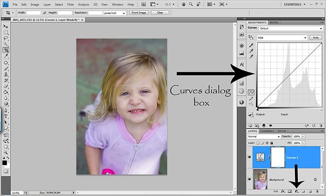


You can use curves for so many things. To color correct skin tones, to correct color casts by setting your shadows/midtone/highlight targets, to bump contrast, lighten or darken a photo, warm up or cool down a photo and for special effects. Curves are a very powerful editing tool.

As you can see, there is one line on the curves dialog box. The center of your line affects the midtones of your photo. The top section of the line affects the highlights of your photos and the bottom section controls the shadows of your photos. Just think middle, high & low. Middle is neutral, high is bright and low is dark! I know…I’m so technical. Hey…it works for me, but I’m blonde! Knowing this gave me much more control over my photos.

The easiest most basic way to use curves is to lighten or darken a photo. I always use adjustment layers so that I can go back and adjust them as I edit and have the ability to use the layer mask if needed. To get a curves adjustment layer, go to the little half white/black circle at the bottom of your layers panel and select curves. Or if you use CS4, you can just click on the curves box on the adjustment panel. All of the layers in this section are adjustment layers. Which means at any time in editing you can go back and adjust your settings and each comes with a white layer mask to paint on. I will go over layer masks in another post as well. If you don’t use them yet, you need to. They will change your life!!!
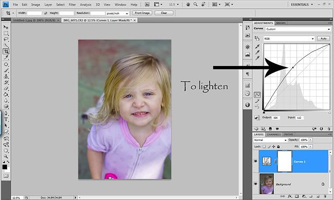
To lighten a photo, just grab the center of the line and pull it up and out a bit like this (you can also change the blend mode to Screen for more brightness and remember you can play with the opacity of the layer too)…
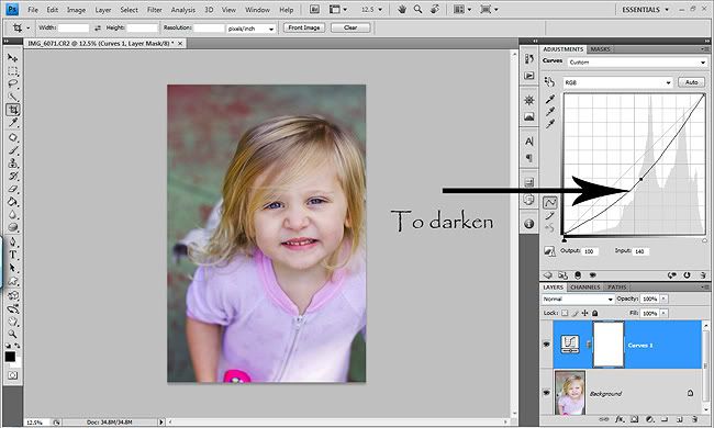
To darken a photo, grab the center of the line and pull it down and out a bit like this (you can also change the blend mode to Multiply to darken even more and remember you can play with the opacity of the layer too).
There are MANY methods to lighten or darken your photos, this is just one way using curves. I will go over other ways in another post.
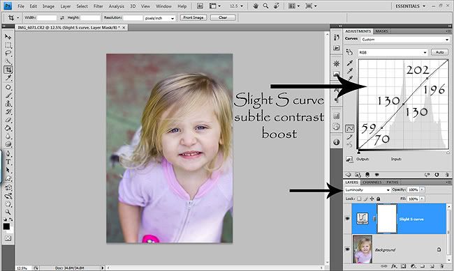
To give your photos a nice gentle contrast boost and depth, you can do a slight S curve. This isn’t as tricky as it sounds and I will walk you through it. When doing any kind of S curve, it’s important to change the Blend mode of this layer to Luminosity. If you don’t, it will add some yellow to your skin tones. And I think that’s one of the things we are always trying to fix in our photos, so we don’t want to do that. And I will say now that I’m not a nit picky person and I do not edit by numbers. I edit by my eye. If I have a little bit of blown sections, it doesn’t ruin my day. Lol! I watch my photos as I edit, but I don’t check all my channels to make sure nothing is being clipped. Yet, I’m just a MWAC (mom with a camera), so if I were in business this would be more important.

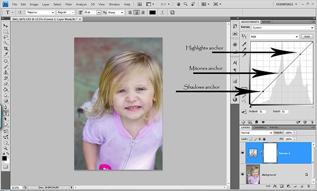
I use a slight S curve on every photo I edit. The easiest way to do it is to open your curves dialog box and click in the middle of the line to put an anchor for your midtones. Then again near the top to put an anchor for your highlights and again near the bottom to put an anchor for your midtones. It’s easy…promise. Here’s a screenshot of what it will look like at this point.
The easiest way is to click on the highlights anchor and hit your up arrow eight or nine times, then click on your shadows anchor and hit the down arrow key about six or seven times. Or you can actually enter in the numbers I use. This takes a bit more time, but you can record it as an action so you don’t have to do it every time. This is what I did. So if you want to enter the numbers I use, click on your highlights anchor and you’ll see at the bottom of the curves dialog box output and input numbers. So after you click on your highlights anchor and enter 202 in the output box and enter 196 in the input box. Then click on your shadows anchor and enter 59 in the output box and 70 in the input box. Your midtones anchor should be anywhere between 128 to 130. Just make sure that the output/input numbers are the same. Now you have a slight S curve that has given your photo a nice pop in contrast. Making the highlights brighter and the shadows deeper and richer. REMEMBER to change the blend mode to Luminosity. A great way to see how adding contrast with curves effects your skin tones is to change the blend mode from Normal to Luminosity a few times while watching the photo. You’ll see the difference. I ALWAYS use Luminosity blend mode when adding contrast with curves, but I don’t when just lighting or darkening a photo. Because when you are using curves to lighten or darken the photo you are adjusting the all three ranges fairly evenly, so it doesn’t give you a bad yellow color shift. A tiny bit, but not enough to affect the skin tones badly. And you always have the option to mask out skin tones if you like the way it affected the background but not the skin tones. So try changing the blend mode to Luminosity when you use the lighten or darken method and you’ll see that it’s a grayish flat look. So I leave the blend mode set to Normal for those. Now here is what your slight S curve will look like and you can turn the eye on and off to see how it effected your photo.
Now onto a strong S curve. Use this with caution and you will almost always have to lower the opacity of the layer or do some skin masking. It will give you lots of contrast to your image. I use my slight S curve and a strong S curve on every photo. Overkill? Maybe…but I like to ride on the edge…well with editing anyway. I’m a big chicken in real life! Ha! But I always lower the opacity of this layer. Some would think then why not use the strong S curve at full strength and omit the slight S curve? And to those of you who are thinking that…it’s a VERY good question. One that I don’t have the answer too! Ha! I started doing it this way and now I’m just used to it. So you can omit the slight S curve and just do the strong S curve at a higher opacity. Whatevea floats your boat. I’m all about options! :O)
So to do a strong S curve, you’ll be doing the same method as the slight S curve. But we’ll be adding two extra anchors. So click on the center and add an anchor there, then one for highlights and one for shadows…like the slight S curve. Now, add another anchor for highlights above the one you already did and another anchor below the shadows anchor you already did. Here is about what your curves dialog box should look like after adding the anchors.
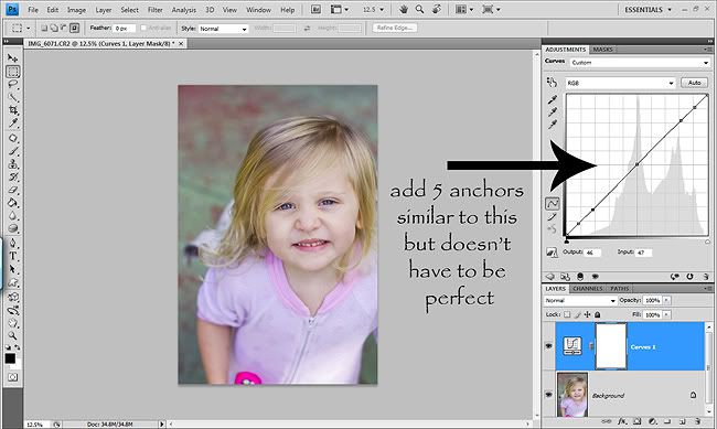
Now you can click on each anchor and use your up arrow keys for highlights and your down arrow keys for shadows. But with this one, I do suggest taking the time to set the numbers. Because this is a strong contrast boost, you want to be pretty accurate. It will take a bit of time to do it, but again if you record it an as action, then all you have to do his hit play each time you want to use is.
Well start with the highlight anchors. Click on the top anchor that you made and type in 248 for output and 239 for input. Then click on the second highlight anchor you added right below, enter 212 in the output and 199 in the input. Your middle anchor should be about 128/128 to 130/130. Just make sure both are the same number in output and input and within the 128 to 130 range. Now go to the bottom shadows anchor you added and type in 4 in the output and 16 in the input. And the last one is the shadows anchor above the bottom one. Enter 36 in the output and 51 in the input. Now you have a strong S curve. REMEMBER again to change the blend mode to Luminosity. Do the test switching it back and forth from Normal to Luminosity so you can see how it’s affecting your photo! And make sure to turn the eye on and off to see how it is affecting your photo. Here is what your strong S curve should look like.
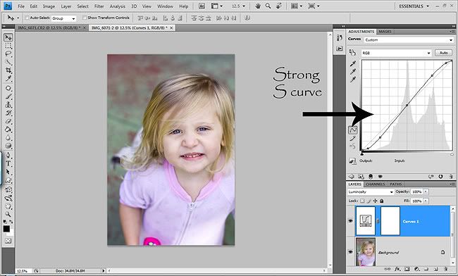
And that’s all there is for curves today. These are the most basic easy beginner curves techniques that will enhance your photos and make them pop. I will post more on curves and more advanced things you can do with them in the future.

The next layer to discuss is levels. I always run a levels layer as well. Today we’ll only be talking about the top three sliders. I won’t be going over setting your shadows/midtone/highlights targets or how to use them creatively. Just a basic enhancement.

Levels work similar to curves in that you can adjust/enhance your shadows, midtones & highlights with the sliders. It gives you a little less control than curves but still gets the job done. I personally love levels and find them as a great defogging tool. And a levels layer in combo with a curves layer can really make your photos pop and remove the haze/film on your photos. Levels also help you remove haze from shots taken in the golden hour that result from too much sun coming into your lens. It’s a beautiful affect when done on purpose, but we don’t always want it. So if you don’t, levels will help you remove the golden haze.

You get a levels layer the same way you get a curves layer. In the little half black/white circle. If you have CS4, just click on the levels box in the adjustment panel.
So pull up a levels adjustment layer. This is what it looks like unaltered.
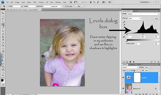
Each photo will need different adjustments here. The thing to do is look at histogram and figure out which you need to slide. We will only be using the top 3 sliders…the input sliders. The output sliders are fun to play with for creative edits. But like I said, I’ll save that for another day!

So when I look at the histogram for this particular shot I can see that my midtones are clipping a bit, or at least too bright and my shadows are flat and could use a little boost in the highlights. The shot needs more work because it's a bit overexposed, washed out and flat. So I took the shadows slider and slid it in until my shadows started looking deeper and richer. I stopped at 30. Then I took the midtones slider and brought them down a bit to 0.95 so the skin tones weren’t so washed out. It’s still looking a little dull and drab, so I slid the highlights slider and stopped at 240. Here is what my levels dialog box looks like.
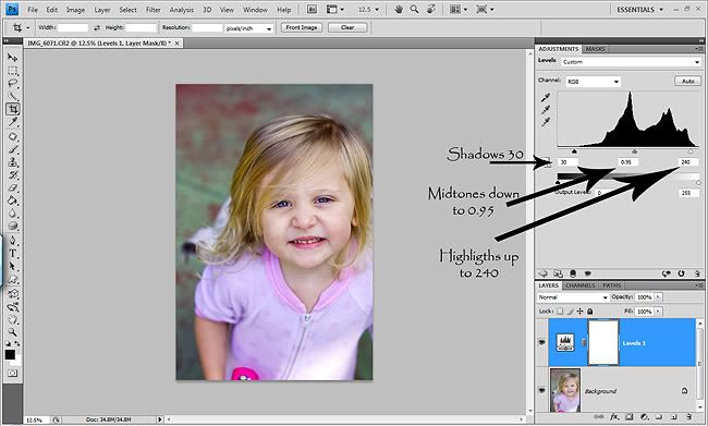
If this shot had been better SOOC, I probably would've only slide the shadows slider from about 5-10, the midtones slider probably up a bit to about 1.05 to about 1.10 and the highlights slider to about 250. That's my range usually for good SOOC shots.
Now…click the eye on and off and you’ll see how amazing this layer is. You’ll see that gray film on your photos disappear and your photo will now have nice skin tones, bright highlights, rich shadows and more depth! If you do just this layer it will be a big difference. If you did a curves layer first then this layer, the difference will still be beautiful, but it won’t jump out at you as much as it would on it’s own. You can leave the blend mode to Normal for the levels layer. Remember…the key to good edits is small changes that together, improve your photo. You don’t want one layer having a big impact on your photo or the final result won’t be as clean. Levels are pretty simple and straight forward but amazing all on their own.

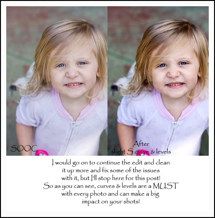
So here is a before shot…SOOC. And the after shot has a slight S curve and a levels layer and that’s it.
If you have any questions, please don’t hesitate to ask in the comments section or email me at momaziggy @ yahoo .com

Next post I’ll go over my workflow. Which isn’t much or very impressive, but it gets the job done for me and will hopefully help you!

And every Wednesday I will review/sample another set of actions that I have with examples! Some will be pay actions with the websites I got them from and some will be free actions also including the websites!

Happy editing!
Thursday, May 14, 2009

Let's talk ACTIONS post 1...

I think that's a fun place to start. So I will share a little something you with...I have a MAJOR addiction to actions. Like I need a serious intervention. I have an actions panel FULL of amazing actions. Which isn't necessarily a bad thing. But when you hardly use them, it's bad! I have serious control issues when I edit and have always preferred to do it by hand.

But recently I've recorded my own actions for standard processing, which has sped up my work flow. And with this I've learned how much I love the speed. So I've told myself that for a couple weeks, I WILL try ALL my actions and see what they are about. I'll buy a set, play with it & dissect it, learn it and then go back to my recorded actions. These poor actions that I buy are not living their destiny. And it's wasting my money. I'm about to change that. And my hope is that as I post these examples and my opinions on different sets that I have & love, it will help you find some great actions that will suit your style and hopefully speed up your work flow as well. Actions are a big time saver, but also an AMAZING way to learn your program. It's a sin to run an action as is, flatten and save. They are meant as a starting off point and then meant to be adjusted. I dissect my actions and try to figure out every layer, what settings and how it's effecting my shots. They should be a learning tool as well as a way to get your edits you can't get on your own and to speed up your work flow.

I do have one set I do use A LOT and I will share those next post. They are my FAVORITE actions of all time and I use them a lot. They are great for outdoor summer shots...just in time. BUT...you'll have to wait a few days to hear about those.

So this is the first post of my actions reviews/samples series.

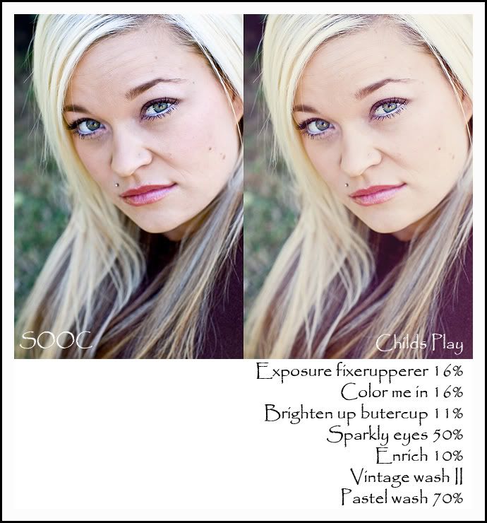
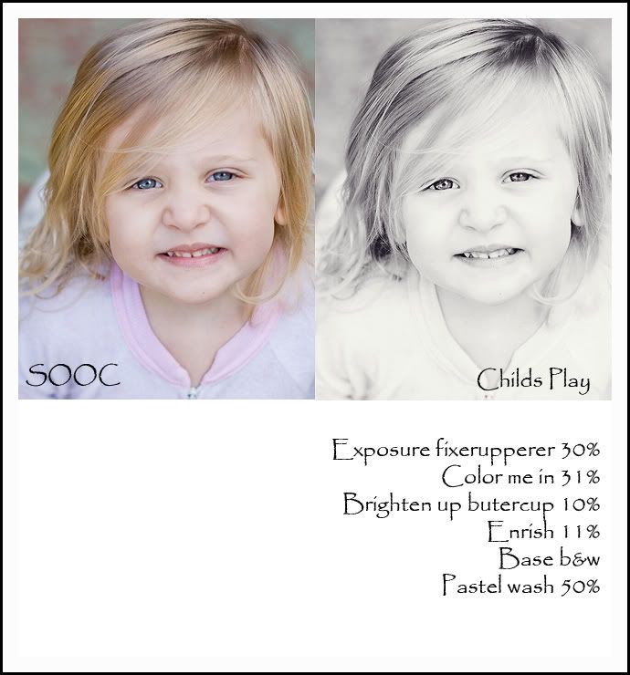
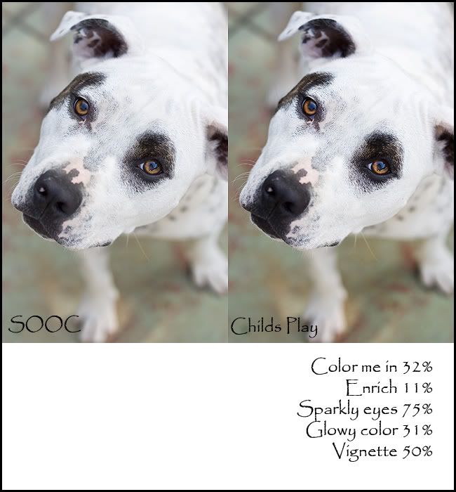
Today...I'm going to talk about a set I bought last week! They are called Childs Play and here is the website... http://www.petamazey.com/actions/actions.html They are great for clean crisp edits and will really help you POP your shots. And they are VERY affordable. When I first bought the action, I thought they were okay. But I decided to really play with them today. To try different combos and see what end result I can get. I tend to be on the creative edit side of the fence and I came up with a combo that I loved. So I give these actions TWO THUMBS UP. And I will say that Childs Play does not know me and I have nothing to gain by this review!
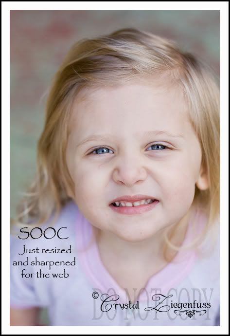
Here is my SOOC shot. Brought through ACR and resized and sharpened for the web in CS4...

And here is my final edit! I'm VERY happy with this!
And here they are side by side.


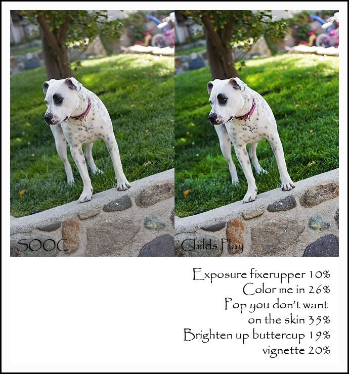
And here are a few more examples...
This is my beautiful cousin...

And Nugget again...
And please excuse my dog pics but I don't have a lot of full size pics on my laptop and I was too lazy to hook up the EHD (external hard drive).
This is Dixie...our beloved crazy yet gorgeous puppy!
And for this shot I just tried a really standard clean it up pop the color edit...
So that's my review and examples for the GREAT Childs Play actions. There is a Flickr group to share shots that you ran her actions on if you want to check it out... http://www.flickr.com/groups/childsplay/
I hope this was helpful and I sure had fun playing with her actions and I will be using them now that I've really gotten my hands dirty with them. And remember...GOOD actions allow you lots of freedom to adjust them!

Wednesday, May 13, 2009

Hi and welcome...

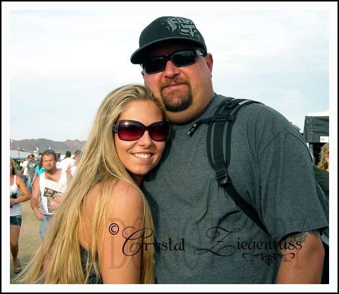
This is my first post on the new Photoshop (PS) blog and I'm very excited! First a little about me... I'm Crystal aka Momaziggy! This is my husband & I taken this month in Vegas at Supercross. WAHOO James Stewart!

I’m a SAHM to two AWESOME girls. This is Haylee… our 7 year old who is finishing up 2nd grade. When did THAT happen? She’s our quiet shy one.

And this is Avyree aka Nugget. She’s 2 and is our wild child!

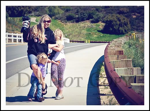
And this shot pretty much sums up my life as a mom. My quiet Haylee clinging to me and Avyree trying to break away and my camera & Zebra Zoom in hand. Ah....you gotta love life!

So where did it all start? Photography & photo editing have become a deep passion in my life. The love affair started back in Jan 08 when I started making sigs on the GREAT board SMFB on iVillage. Anne was the BEST CL and taught me so much. I loved making sigs but what I really loved was editing the photos for the sigs. It was the editing that drove me. And as I learned more about editing (although looking back I really didn’t know anything lol), I found that I was becoming frustrated with the quality of my photos. So June 30th last year I purchased my first DSLR. I bought a Canon XSi. An entry level DSLR. At that time I just wanted better quality Auto shots and maybe I’d play a little bit with some of the other modes. Well that didn’t last long. I was instantly hooked! I dove in head first.
I learned everything I could. In this time my DEAR friend Amanda Ward (also a photographer and when her site debuts, you’ll get to see it here) encouraged me to jump from PSP9 to PSCS3. I thought I could do everything I needed in this little PSP program. But once I got my hands on PSCS3, I realized what a difference a program could make. So I was now throwing myself into learning photography and PSCS3. And the passion really took off from there!

Fast forward to today. I am a photography & editing JUNKIE and it’s a crazy obsession. Ask anyone who knows me and they’ll agree! I do this for the love of it, not to make money. I love the art of it and I love the technical stuff. I now have PSCS4 and couldn’t be happier with it! Powerful amazing program that you can do pretty much anything you want in.

For the first time in my life I have a passion…something that drives me, something my blonde brain can retain (lol) and something that makes me feel like more than just a mom. Not that it's not rewarding...well I don't have to explain myself to you girls. If you're a mom you know what I'm saying. I finally have * my thing * and I’m enjoying the ride…not the debt tho! Ha!

Now I’m getting ready to upgrade cameras. The need for this Canon 5D Mark II has taken on a life of it’s own. I want it more than I want Orange Chicken from Panda Express. And for those of you who know me…THAT’S BIG! :O)

So I wanted a place and outlet to post about my crazy PS obsession because I don’t think my husband or friends can handle it anymore. I wanted a place to share and help…to pay it forward. When I first started I was LOST…and I mean LOST. Especially with photography. So whatever I can give back to others who want to learn to get better end results from their SOOC shots, I’m happy to do.

I don’t know a lot yet…notice the YET…but what I do know I want to pass on. And I’m obsessed about learning and am brought so much joy in sharing.

So I hope this blog will serve as a good resource for others and help them the way I was helped along the way.

I’ll be posting tuts on techniques that I already know and techniques that I learn. I have a couple workshops I want to take (MCP Actions workshops) for color correcting and using curves to their fullest potential. I'll be sharing great sites that have helped me and given me inspiration. I'll post little tips and tricks that are quick and easy. And I’ve started recording a few action sets that I want to share and will always share the ones I make in the future. I just have to figure out the best way to share them.

So bear with me as I get this all figured out.

This is going to be FUN!

Search My Blog

Followers

About my PS Blog

Hi, my name is Crystal and I am addicted to Photoshop. I have PSCS4 and it's my other half. I love photography, but sometimes I think it's a means to edit!

So I thought it would be fun to have a place to post the free action sets I record, tips and tricks that I learn in PS and tuts for various different types of photo editing.

I hope you enjoy and find my PS blog helpful and if you have any questions, leave me a comment with your questions and your email address and I will get back to you!

Happy editing!

About Me

My photo
I am a stay at home to 2 great girls. My older daughter Haylee just started middle school and my younger daughter Avyree is in 1st grade! I have been married 11 years to my hubs Eric. I got my first DSLR June 31, 2008 and have been hooked ever since! My style is primarily Lifestyle! I like to take a natural and real life approach to my images! I want them to remind me of WHO my girls were when they were little, not just what they looked like. I love to edit and my editing style is always evolving and changing! I like variety and photography is a means to edit! I shoot Canon (full frame) and almost only primes. I pull out my wide angle zoom from time to time! Thanks for stopping by and I hope you like our story...
Background paper by Kay Miller

  © Blogger template 'Photoblog' by Ourblogtemplates.com 2008

Back to TOP