Random tips for a random day...
I'm feeling pretty random today. My thoughts are everywhere and no where. But I just felt the urge to post today. So I thought of some random things I do in CS4 fairly regularly. I wanted to share them with you hoping they might help you as well. And at the bottom I'll show you my FAVORITE thing for editing!
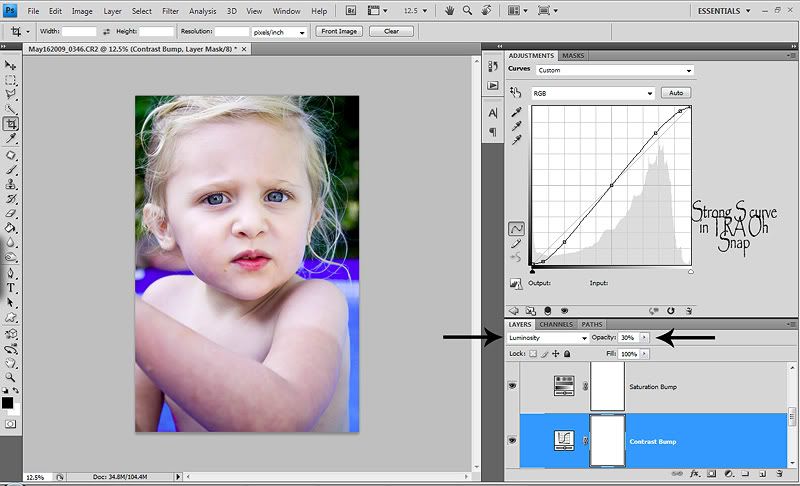
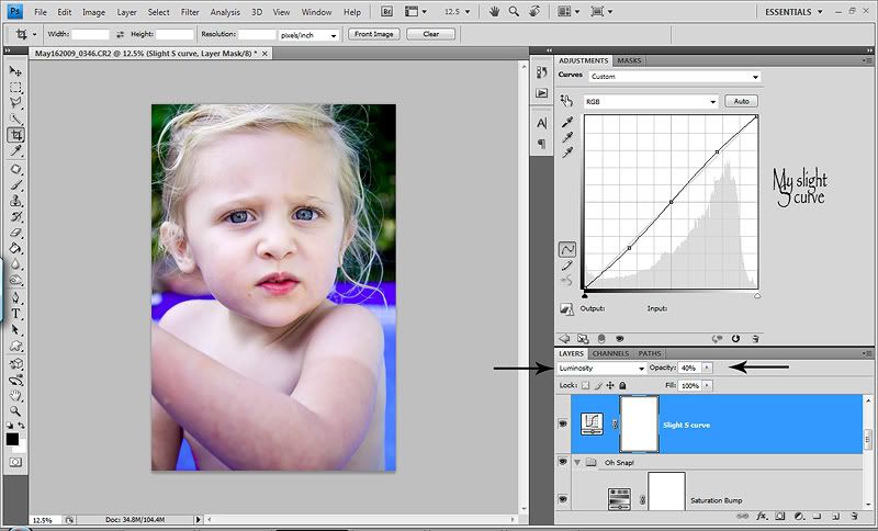
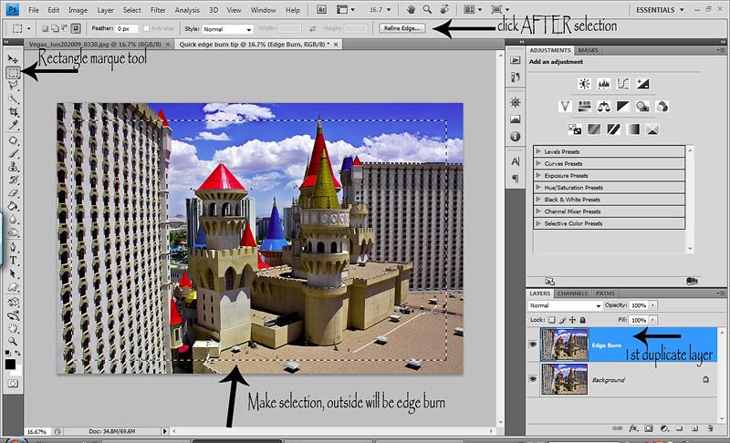
So to start off today's random...ness, I thought I'd show you the best, fastest and most natural method of creating and edge burn/vignette. There are hundreds of different ways of doing it and I've tried MANY. To date tho, this is my favorite. It's really fast and a very natural look. I used to lower my edge burn opacity down to 10-30% usually because they were pretty strong and just didn't look natural. Now with this method, I range between 30-75% opacity. I don't use edge burns as often anymore (the newness & excitement wore off) but when I do, this is my go to method!
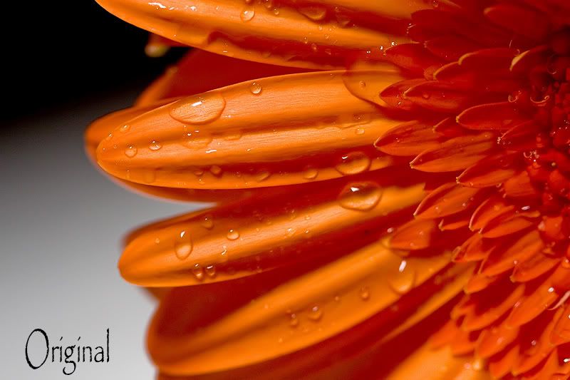
Open your image and duplicate the layer (ctrl/j). Make sure you are on the top photo layer. Select your Rectangle Marque tool...no feather needed. Make your selection, keeping in mind the edge burn will be on the OUTside of you selection. Notice the Refine Edge button. Once you've made your selection it should look something like this...
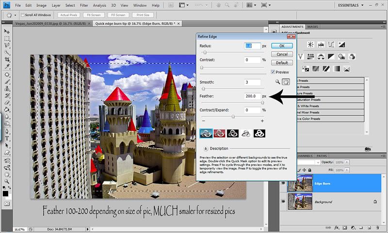
Once you have your selection, hit the Refine Edges button and put in anywhere between 100-200 in the Feather section. I THINK Radious is default to 1 and I just leave it be. I shoot in RAW so my images are very large, I always use 200. But for smaller images, you'll want a smaller number. Play with the feather option here for different size pics. Then hit okay...
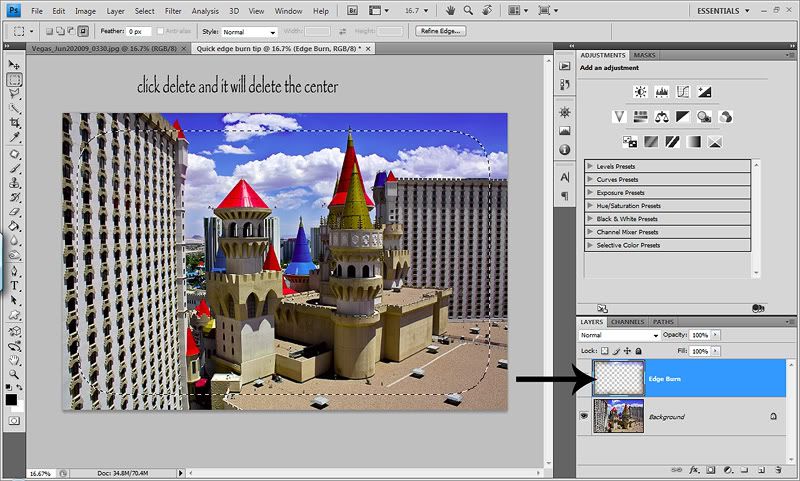
Now hit the delete key. What this does is delete the center which is what you've selected. And because you put a 200 Feather on it, it will feather it nicely, for a smooth natrual transition...
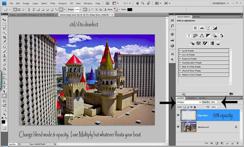
So you are probably wondering what the heck is going on because obviously your image looks the exact same. We are about to change that. Now hit ctrl/d to deselect and get rid of the selection. Now go to your blend options and change it to Multiply. Now you edge is DARK. This is your edge burn. You can play with different blend mode options for different edge looks. You will probably also want to play with the opcaity. At 100%, it's pretty strong. I chose 50%. Now normally I wouldn't put an edge burn on this shot, but I just grabbed this Vegas pic for a quick example.
And if you want, you can change the order up of changing the blend mode so that you can see the burn right away. Right after you duplicate your photo layer, you can then change it to Multiply and then make your selection and so on. Some prefer to see the dark before making their selection. You may already do this type of edge burn, but if not...give it a try. You might prefer it and you might hate it! :O) Whateva floats your boat.
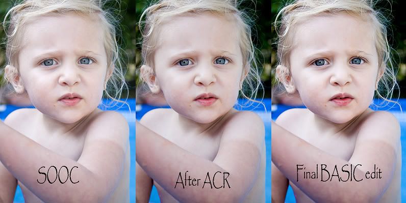
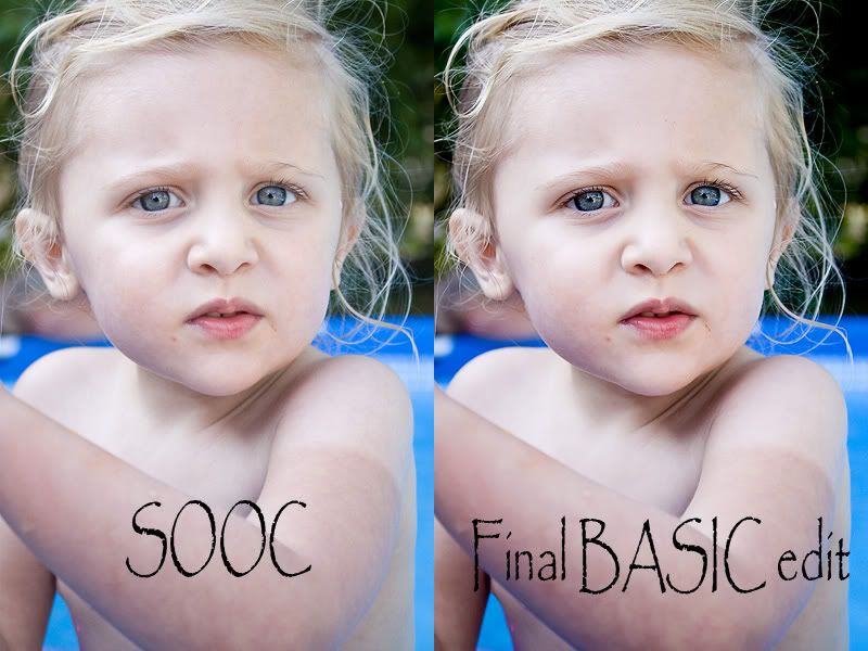
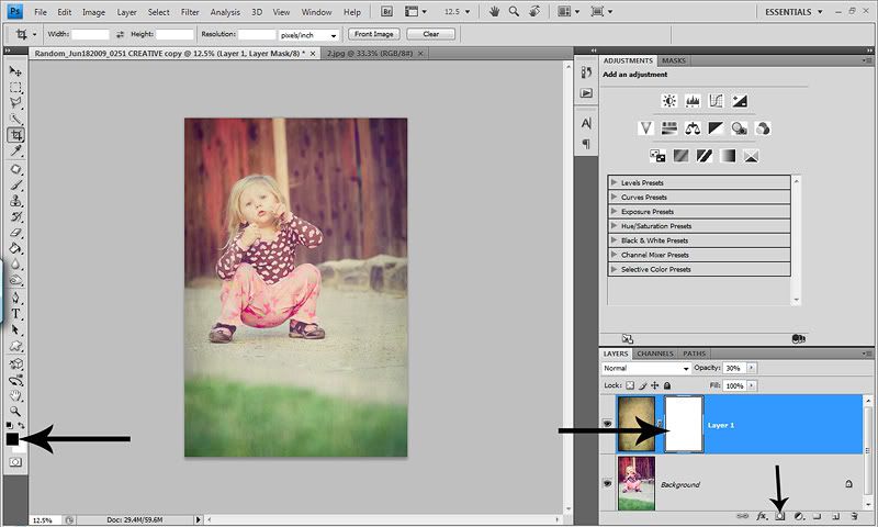
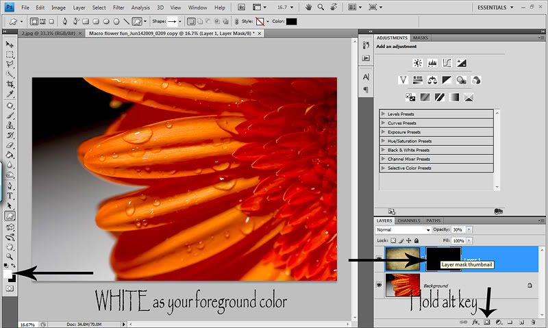
Then next tip I wanted to share is also in my Basic workflow post, but I wanted to go over it again because I LOVE it. It's about dodging (lightening) & burning (darkening) certain areas of your photo. I never use PS's dodge/burn tools anymore. This is the only way I dodge/burn and have it recorded into my All in One action. This method works on 1 layer, so you can do both on one layer and have control with your brush opacity.
I think the key to dodging/burning is LOW opacity brush strokes. It will take more time, but will result in a more natural final image. What I love about dodging/burning are two things. One...you can change the attention of your photo and where the light falls...within reason of course. Now I burn much more than I dodge. And what I LOVE about burning the most is that it can take dull flat colors and areas of your image and make them deep and rich. You can also use this layer to make an edge burn or a faded edge.
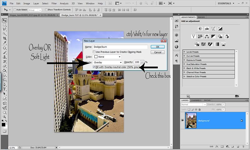
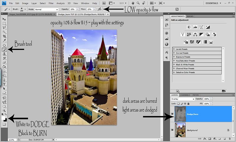
First thing you need to do is create a new layer. This step is important. You do not want to create a new layer in the layers panel. Either hit ctrl/shift/n or go up to Layers>New>New Layer. When the dialog box comes up, change the blend mode to either Overlay (which I use) or Soft Light. Then under the blend mode, check the box to fill with 50% gray. Here is what the dialog box looks like...
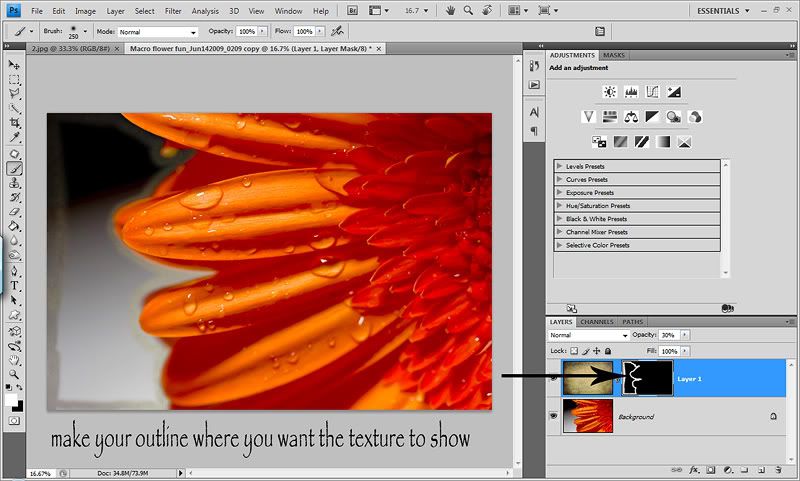
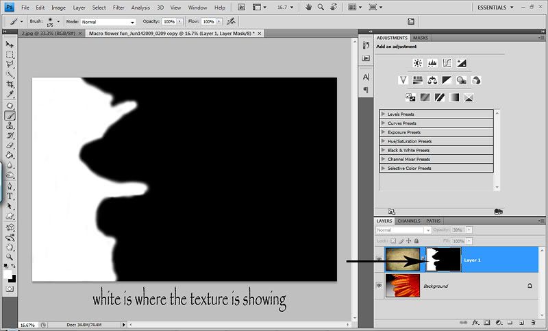
Now when you look at your layers panel, you'll see that the new layer is now gray, but you can't see it on your photo. Now select your brush tool. To burn, change your foreground color to BLACK. Set your opacity to about 10% and your flow to about 15%. For some odd reason, I always go 5% up from my opacity for my flow. I'm odd that way! Ha! Now just paint on your image where you want to burn/darken or enrich colors. This works great on grass, concrete or asphalt. I like to use it on the background a lot so that I can deepen/darken it and it helps the subject POP against the darker background. Then to dodge, you just change your foreground color to white and I would lower your opacity/flow rate. You have to be more careful when dodging because it can strip/fade color and leave it lifeless. So be very careful when dodging and go LIGHT. It's better to go over a section a few times at a VERY low opacity brush, then to blast it and have that blasted area look ghost like and faded. And for that reason, I NEVER dodge eyes. I hate the vacant, lifeless, no detail look it gives. Not insulting anyone who does, I'm just sayin! Ha! :O) And a great way to see how it's effecting your image is to toggle the dodge/burn layer on and off. That is really when you get to see how well your image has transformed!
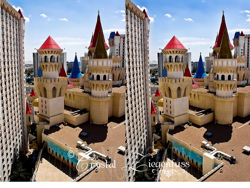
Here is my before/after shot. It's subtle which I think is what you want. You want baby steps that slowly transform your images. Not one step that says WOW...look at me. Side by side it isn't as noticable. But when I toggled the layer on and off I could see how much I was able to control where the light fell on the image and how I was able to deepin and enrich the colors. And let's say you want to burn one section just a tad and want to burn another section a lot...just change your opacity/flow rate as you dodge or burn different areas for COMPLETE control. And of course, you can always lower the opacity of the layer. So give it a try and I think you'll prefer this method of dodging/burning.
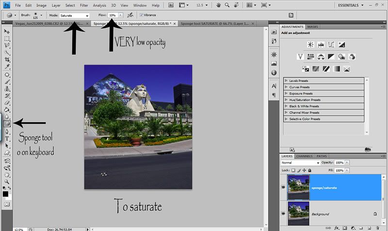
Now in talking about deepening and enriching colors, I thought about a tool that I use only once in a while, but am VERY fond of. It's called the Sponge tool. Before I saw a tut on ILP, I'd never even heard of it. Now I think it's great. The sponge tool allows you to do two things...Saturate areas of your photo or desaturate areas of your photo. Again the key here is LOW opacity brush strokes.
So lets say you have an image with pretty greens and flowers etc and you want to bring out the colors a BIT. Just a slight selective color pop without risking your colors going neon and only on certain parts of your image.
Open the image and duplicate the layer (ctrl/j). You ALWAYS want to work on duplicate layers so you can control the opacity of that layer. Now hit o on your keyboard. If the sponge tool doesn't pop up, hold down the shift key while pressing o until it pops up...or just click on it. I'm a keyboard shortcut JUNKIE! :O)
Now at the top it gives you the option to Saturate or Desaturate. Select Saturate. Now change the opacity of the sponge tool to about 10%. Again, we want it to look natural. Now simply start painting on the image where you want the colors saturated. Here is a screenshot...
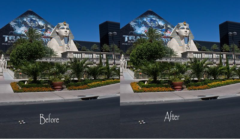
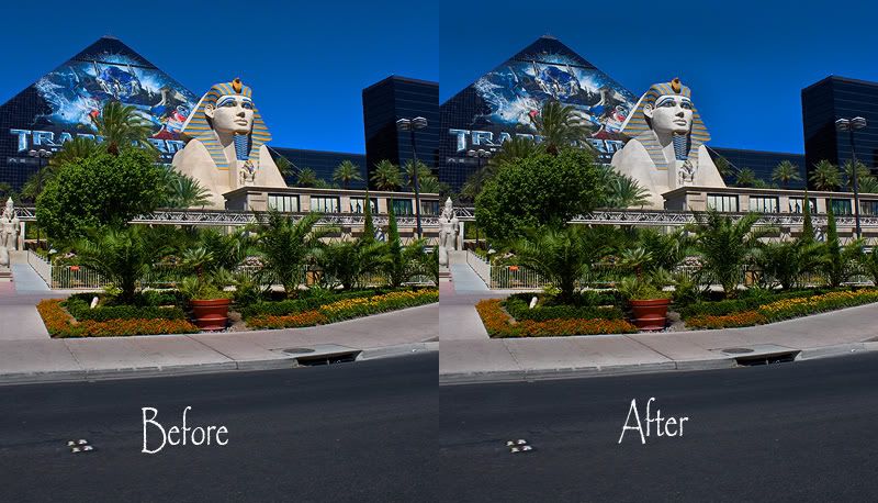
And here is a quick before/after shot. Excuse all my Vegas pics. They are the only ones on my laptop right now because I'm still editing them and haven't moved them to my EHD yet. As you'll see, it's not a crazy difference. Because we want subtle improvements. But look at the logo on the Luxor Hotel, the Sphynx and the trees/grass/flowers. Just a nice color pop! This method will give you a brighter color pop vs burning will give you a richer deeper more urban color pop.
You also have the option to desaturate. I over saturated the same original photo for this tut. This is NOT how I edit...haha! So now my colors are wonky and I want to tone it down a bit. So you do the exact same thing, but this time choose Desaturate instead. You can use a bit of a higher opacity for this, but I wouldn't go too high or your colors can start to look gray. I've used this method when I have shots where the magentas in my kids clothing can be overwhelming to the shot. And the great thing is you can Sat or Desat on the same layer just by choosing either one and playing with the opacity of the Sponge tool!
So now that I'm on the subject of color pop, I learned a cool little trick for giving a good color pop to your shots. I will say this before hand, it's STRONG and you WILL need to lower the opacity of the layer pretty low and you WILL most likely want to mask it off of skin tones. But it's a great method for landscape shots or portraits where there is a lot of scenery in your shot. Again, I like to edit hot and dial down, so the method here is pretty strong. I'd rather have to tone it down, then want it more and not have enough. KWIM? :O)
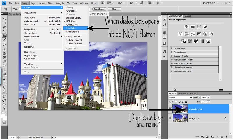
First thing you want to do is duplicate your photo layer (ctrl/j) and I like to name my layers. So I name it LAB color POP. Yes, I said LAB, but don't worry, it's EASY and won't degrade the quality of your image from switching. Now go to Image>Mode>LAB Color. Here's a screenshot...
IMPORTANT...a dialog box will come up and ask you if you want to Flatten...choose DON'T FLATTEN...
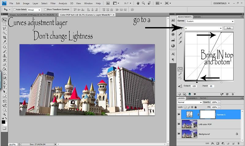
Now you are in LAB mode. Not too scary huh? Open a curve adjustment layer. You'll see in the drop down menu you see Lightness (for the L in LAB)...don't do anything with this channel. Click the arrow on the drop down menu and choose a (for the A in LAB....seeing a pattern...lol). Now take the top right anchor and pull it in a bit, keeping it touching the top of the box. This is where you have some control on how MUCH color pop you'll have. The further you go in, the stronger the color pop. Then go to the bottom left anchor and do the same. It's important to pull both in the SAME amount or you will get bad color shifts and casts. Here is what my channel a looks like..
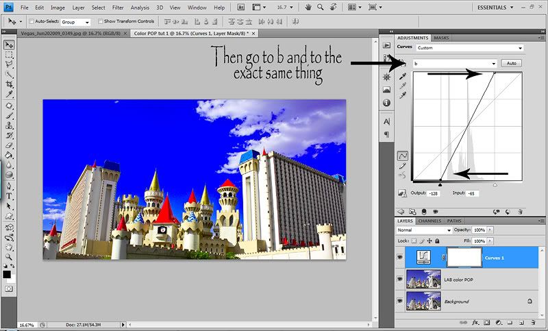
Now go to channel b and do the exact same thing. Again, making sure that you pull the top & bottom the same amount and the same amount as you did in channel a. Here's is what channel b looks like...
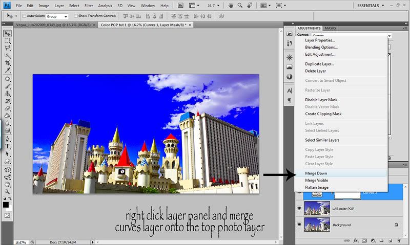
Now we want to go back to RGB Color but we cannot do it with an adjustment layer open. So right click on the curves adjustment layer and choose merge down. So you are merging down that layer onto the top photo layer. Then go back to Image>Mode>RBG Color. Again it will ask you if you want to flatten...choose DON'T FLATTEN or you will no have control to play with layer opacity or masking...
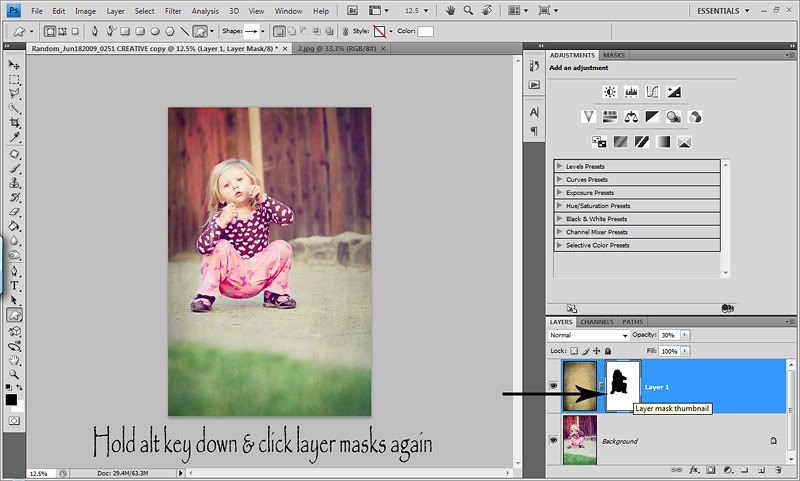
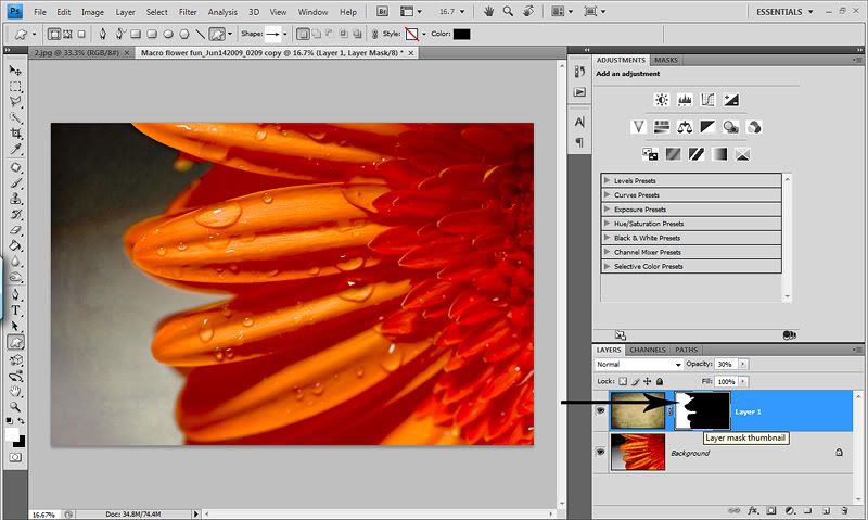
Now you have a top photo layer that has the LAB color POP on it. I like to add a white layer mask so that I can mask out any areas that I want less color pop. Or you could add a black layer mask if you only want to pop selective areas of your photo. Then play with the opacity of the layer. I recorded an action for this so I can do it in the push of 1 button.

Here is a quick before and after with my opacity on the after at 30%...
And last final thing for the day. I wanted to share with you something that has made my editing life SO much easier and a joy to do.
This was my Mother's Day present and I will NEVER edit without one again...
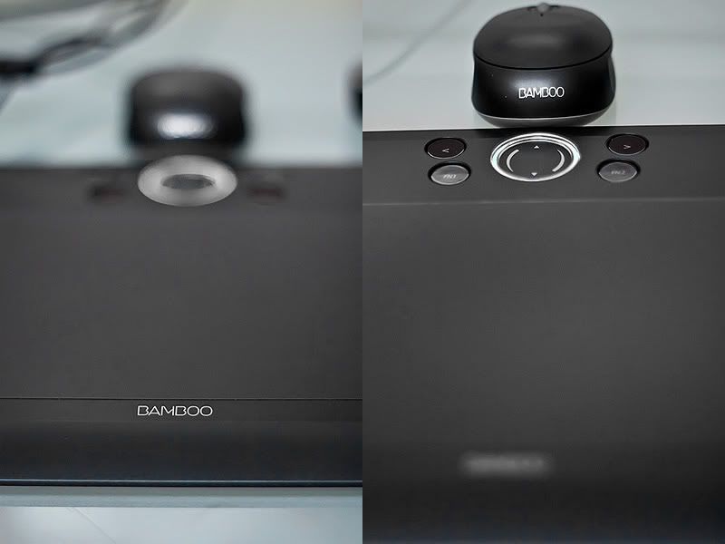
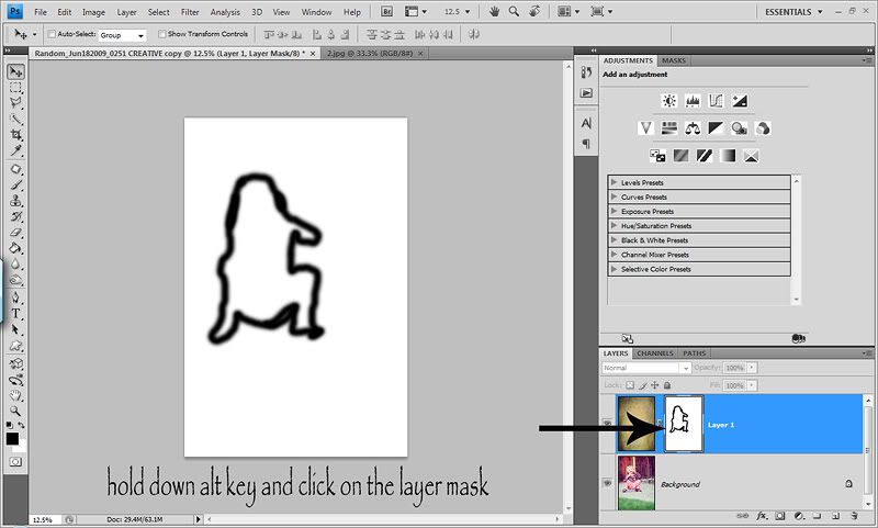
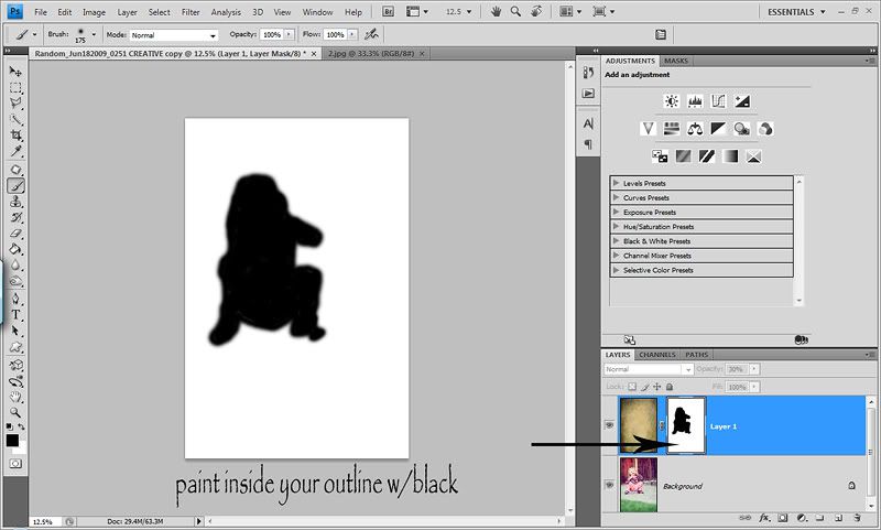
Please excuse my shots and colors here. I didn't have the original of these, so I had to pull them from my photography message board and they are a MESS. But this is my Wacom Bamboo Fun Medium tablet! I HEART it and am ready to marry it! Masking is actually EASY & FUN now. Making selections is a BREEZE. So...if you have some extra money and mask/select a lot, or like to draw and create things in PS...you really should get this! You can get them in electronic stores, Amazon, Camera stores and online camera stores. You won't regret it!
So that's my randomness for the day. I hope you find something in this post that will be helpful! Have a great weekend girls! :O)
So to start off today's random...ness, I thought I'd show you the best, fastest and most natural method of creating and edge burn/vignette. There are hundreds of different ways of doing it and I've tried MANY. To date tho, this is my favorite. It's really fast and a very natural look. I used to lower my edge burn opacity down to 10-30% usually because they were pretty strong and just didn't look natural. Now with this method, I range between 30-75% opacity. I don't use edge burns as often anymore (the newness & excitement wore off) but when I do, this is my go to method!
Open your image and duplicate the layer (ctrl/j). Make sure you are on the top photo layer. Select your Rectangle Marque tool...no feather needed. Make your selection, keeping in mind the edge burn will be on the OUTside of you selection. Notice the Refine Edge button. Once you've made your selection it should look something like this...
Once you have your selection, hit the Refine Edges button and put in anywhere between 100-200 in the Feather section. I THINK Radious is default to 1 and I just leave it be. I shoot in RAW so my images are very large, I always use 200. But for smaller images, you'll want a smaller number. Play with the feather option here for different size pics. Then hit okay...
Now hit the delete key. What this does is delete the center which is what you've selected. And because you put a 200 Feather on it, it will feather it nicely, for a smooth natrual transition...
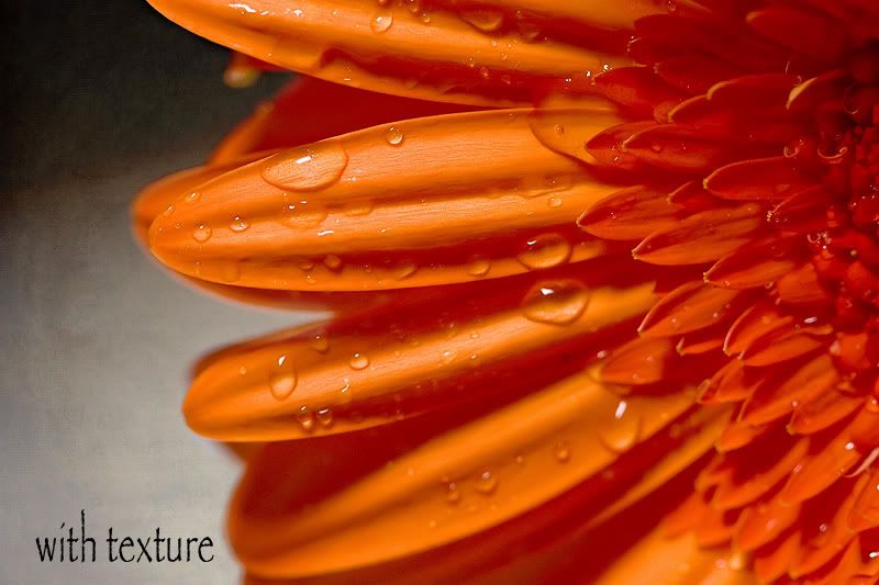
So you are probably wondering what the heck is going on because obviously your image looks the exact same. We are about to change that. Now hit ctrl/d to deselect and get rid of the selection. Now go to your blend options and change it to Multiply. Now you edge is DARK. This is your edge burn. You can play with different blend mode options for different edge looks. You will probably also want to play with the opcaity. At 100%, it's pretty strong. I chose 50%. Now normally I wouldn't put an edge burn on this shot, but I just grabbed this Vegas pic for a quick example.
And if you want, you can change the order up of changing the blend mode so that you can see the burn right away. Right after you duplicate your photo layer, you can then change it to Multiply and then make your selection and so on. Some prefer to see the dark before making their selection. You may already do this type of edge burn, but if not...give it a try. You might prefer it and you might hate it! :O) Whateva floats your boat.
Then next tip I wanted to share is also in my Basic workflow post, but I wanted to go over it again because I LOVE it. It's about dodging (lightening) & burning (darkening) certain areas of your photo. I never use PS's dodge/burn tools anymore. This is the only way I dodge/burn and have it recorded into my All in One action. This method works on 1 layer, so you can do both on one layer and have control with your brush opacity.
I think the key to dodging/burning is LOW opacity brush strokes. It will take more time, but will result in a more natural final image. What I love about dodging/burning are two things. One...you can change the attention of your photo and where the light falls...within reason of course. Now I burn much more than I dodge. And what I LOVE about burning the most is that it can take dull flat colors and areas of your image and make them deep and rich. You can also use this layer to make an edge burn or a faded edge.
First thing you need to do is create a new layer. This step is important. You do not want to create a new layer in the layers panel. Either hit ctrl/shift/n or go up to Layers>New>New Layer. When the dialog box comes up, change the blend mode to either Overlay (which I use) or Soft Light. Then under the blend mode, check the box to fill with 50% gray. Here is what the dialog box looks like...
Now when you look at your layers panel, you'll see that the new layer is now gray, but you can't see it on your photo. Now select your brush tool. To burn, change your foreground color to BLACK. Set your opacity to about 10% and your flow to about 15%. For some odd reason, I always go 5% up from my opacity for my flow. I'm odd that way! Ha! Now just paint on your image where you want to burn/darken or enrich colors. This works great on grass, concrete or asphalt. I like to use it on the background a lot so that I can deepen/darken it and it helps the subject POP against the darker background. Then to dodge, you just change your foreground color to white and I would lower your opacity/flow rate. You have to be more careful when dodging because it can strip/fade color and leave it lifeless. So be very careful when dodging and go LIGHT. It's better to go over a section a few times at a VERY low opacity brush, then to blast it and have that blasted area look ghost like and faded. And for that reason, I NEVER dodge eyes. I hate the vacant, lifeless, no detail look it gives. Not insulting anyone who does, I'm just sayin! Ha! :O) And a great way to see how it's effecting your image is to toggle the dodge/burn layer on and off. That is really when you get to see how well your image has transformed!
Here is my before/after shot. It's subtle which I think is what you want. You want baby steps that slowly transform your images. Not one step that says WOW...look at me. Side by side it isn't as noticable. But when I toggled the layer on and off I could see how much I was able to control where the light fell on the image and how I was able to deepin and enrich the colors. And let's say you want to burn one section just a tad and want to burn another section a lot...just change your opacity/flow rate as you dodge or burn different areas for COMPLETE control. And of course, you can always lower the opacity of the layer. So give it a try and I think you'll prefer this method of dodging/burning.
Now in talking about deepening and enriching colors, I thought about a tool that I use only once in a while, but am VERY fond of. It's called the Sponge tool. Before I saw a tut on ILP, I'd never even heard of it. Now I think it's great. The sponge tool allows you to do two things...Saturate areas of your photo or desaturate areas of your photo. Again the key here is LOW opacity brush strokes.
So lets say you have an image with pretty greens and flowers etc and you want to bring out the colors a BIT. Just a slight selective color pop without risking your colors going neon and only on certain parts of your image.
Open the image and duplicate the layer (ctrl/j). You ALWAYS want to work on duplicate layers so you can control the opacity of that layer. Now hit o on your keyboard. If the sponge tool doesn't pop up, hold down the shift key while pressing o until it pops up...or just click on it. I'm a keyboard shortcut JUNKIE! :O)
Now at the top it gives you the option to Saturate or Desaturate. Select Saturate. Now change the opacity of the sponge tool to about 10%. Again, we want it to look natural. Now simply start painting on the image where you want the colors saturated. Here is a screenshot...
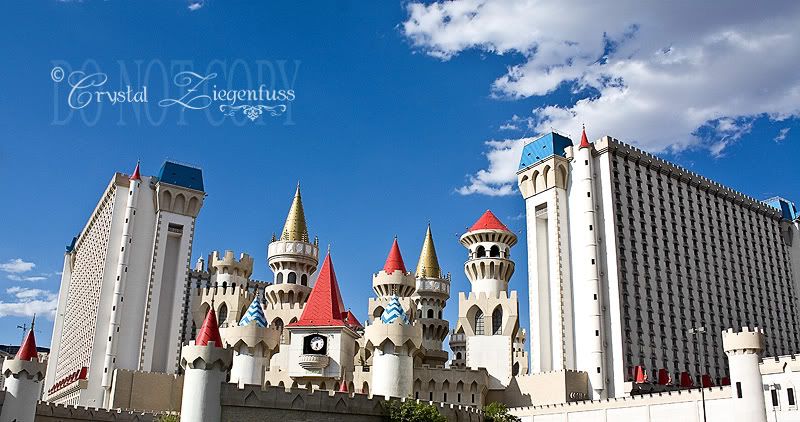
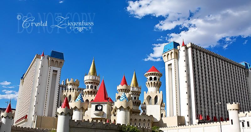
And here is a quick before/after shot. Excuse all my Vegas pics. They are the only ones on my laptop right now because I'm still editing them and haven't moved them to my EHD yet. As you'll see, it's not a crazy difference. Because we want subtle improvements. But look at the logo on the Luxor Hotel, the Sphynx and the trees/grass/flowers. Just a nice color pop! This method will give you a brighter color pop vs burning will give you a richer deeper more urban color pop.
You also have the option to desaturate. I over saturated the same original photo for this tut. This is NOT how I edit...haha! So now my colors are wonky and I want to tone it down a bit. So you do the exact same thing, but this time choose Desaturate instead. You can use a bit of a higher opacity for this, but I wouldn't go too high or your colors can start to look gray. I've used this method when I have shots where the magentas in my kids clothing can be overwhelming to the shot. And the great thing is you can Sat or Desat on the same layer just by choosing either one and playing with the opacity of the Sponge tool!
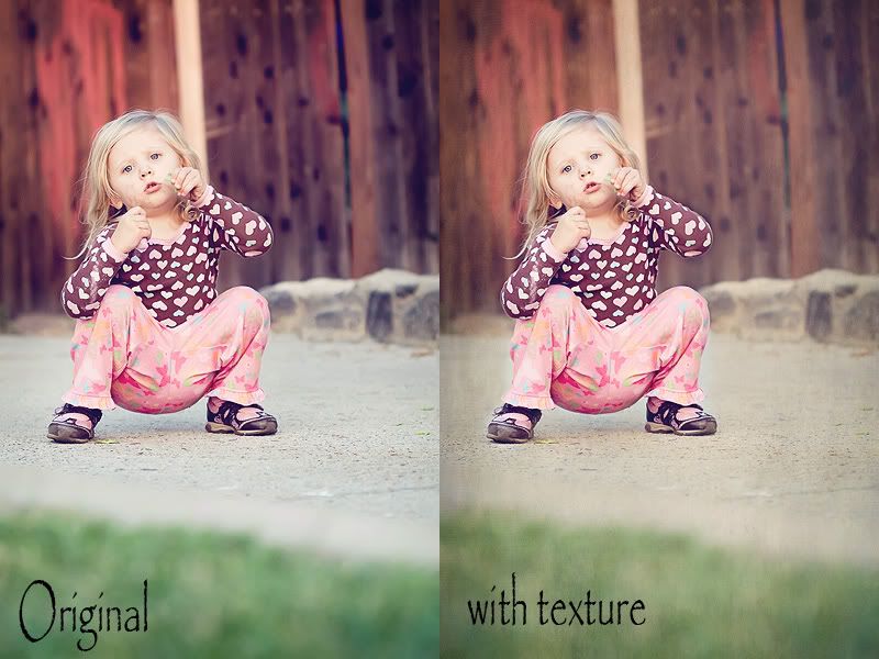
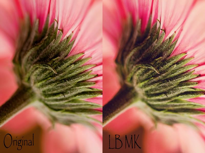
So now that I'm on the subject of color pop, I learned a cool little trick for giving a good color pop to your shots. I will say this before hand, it's STRONG and you WILL need to lower the opacity of the layer pretty low and you WILL most likely want to mask it off of skin tones. But it's a great method for landscape shots or portraits where there is a lot of scenery in your shot. Again, I like to edit hot and dial down, so the method here is pretty strong. I'd rather have to tone it down, then want it more and not have enough. KWIM? :O)
First thing you want to do is duplicate your photo layer (ctrl/j) and I like to name my layers. So I name it LAB color POP. Yes, I said LAB, but don't worry, it's EASY and won't degrade the quality of your image from switching. Now go to Image>Mode>LAB Color. Here's a screenshot...
IMPORTANT...a dialog box will come up and ask you if you want to Flatten...choose DON'T FLATTEN...
Now you are in LAB mode. Not too scary huh? Open a curve adjustment layer. You'll see in the drop down menu you see Lightness (for the L in LAB)...don't do anything with this channel. Click the arrow on the drop down menu and choose a (for the A in LAB....seeing a pattern...lol). Now take the top right anchor and pull it in a bit, keeping it touching the top of the box. This is where you have some control on how MUCH color pop you'll have. The further you go in, the stronger the color pop. Then go to the bottom left anchor and do the same. It's important to pull both in the SAME amount or you will get bad color shifts and casts. Here is what my channel a looks like..
Now go to channel b and do the exact same thing. Again, making sure that you pull the top & bottom the same amount and the same amount as you did in channel a. Here's is what channel b looks like...
Now we want to go back to RGB Color but we cannot do it with an adjustment layer open. So right click on the curves adjustment layer and choose merge down. So you are merging down that layer onto the top photo layer. Then go back to Image>Mode>RBG Color. Again it will ask you if you want to flatten...choose DON'T FLATTEN or you will no have control to play with layer opacity or masking...
Now you have a top photo layer that has the LAB color POP on it. I like to add a white layer mask so that I can mask out any areas that I want less color pop. Or you could add a black layer mask if you only want to pop selective areas of your photo. Then play with the opacity of the layer. I recorded an action for this so I can do it in the push of 1 button.
Here is a quick before and after with my opacity on the after at 30%...
And last final thing for the day. I wanted to share with you something that has made my editing life SO much easier and a joy to do.
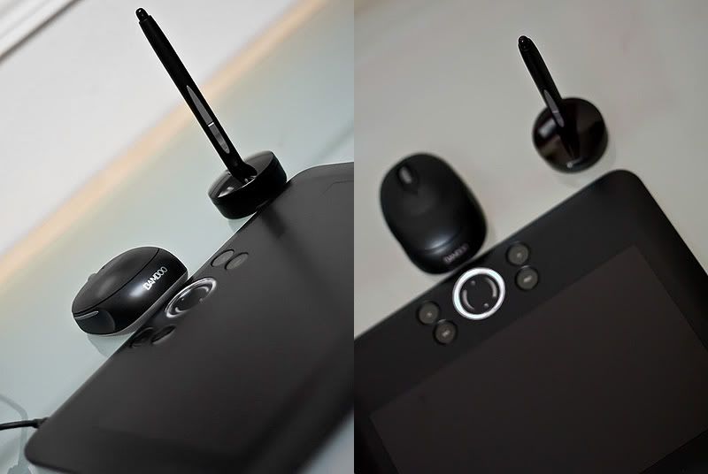
This was my Mother's Day present and I will NEVER edit without one again...
Please excuse my shots and colors here. I didn't have the original of these, so I had to pull them from my photography message board and they are a MESS. But this is my Wacom Bamboo Fun Medium tablet! I HEART it and am ready to marry it! Masking is actually EASY & FUN now. Making selections is a BREEZE. So...if you have some extra money and mask/select a lot, or like to draw and create things in PS...you really should get this! You can get them in electronic stores, Amazon, Camera stores and online camera stores. You won't regret it!
So that's my randomness for the day. I hope you find something in this post that will be helpful! Have a great weekend girls! :O)