Hi & welcome to my PS blog! This blog is for full PS although some steps will also work in PSE. Most actions, unless stated are not PSE compatiable. I do try to make an action for PSE from time to time. I hope you have fun here and learn some things along the way. If you have any questions, just drop me a comment! :O)

Friday, July 31, 2009

How to FIX my b&w action set...

I am sorry for the way I recorded the b&w action set and have learned my lesson! The more I play with actions that I've bought, the more I learn about how I like them to run! And I will no longer record future actions this way.

But there is hope! Do you hate the intro/closing? Hate that each action duplicates and renames your photo? I would too! It's VERY easy to fix and will only take a few seconds!

So first, open your actions panel F/9. Now open the b&w folder. Start at the top and open the first action in the set by clicking on the little arrow next to the name. You can see all the steps. The first one is Stop, the second is Duplicate first document. Then the very last step is Stop again. Simply click on the first stop once, then go down to the bottom of the actions panel and hit the trash can. Now the intro will not play. Then go to Duplicate first document, click on it once and hit the trash can. Now the action will no longer duplicate your photo in return, you will retain your file name. Then click on the last Stop (if you want) and delete that. Now you can an action that will just run. Then you can go to town adjusting all the layers...even turning some off.

Here is a screenshot of which ones to delete...


Now you can go onto to save this action, so that if PS ever dumps it for some crazy reason, you won't have to redo all the delete. Just click on the folder and follow the screenshot below. You have two choices as how to save it. You can save it with the same name and save over my original ATN file, or you can save with a different name or name extension so that you always have my original ATN file...


And it's that easy. Again, future actions will be recorded in a much more efficient way! I hope this helps and makes you want to use the set more often!

***I'm also working on a NEW action set as I type this. It will be a creative set with 6 different tonal washes with the option of a b&w layer! I'm really excited about this set, but still have some testing to do before I post it. So hopefully next week! :O)

HAPPY FRIDAY and I hope everyone has a GREAT weekend!

Wednesday, July 29, 2009

What do YOU want to see here?

I haven't forgotten about the blog. Just not feeling very inspired at the moment. I get an idea to post, but it's not great so I don't. I'm feeling very indesicive right now.

So I thought I'd take requests, ideas etc. Any specific tuts or techniques you want to see that I haven't posted yet? Any actions you want me to TRY to create....notice the TRY...ha! And action reviews...if so which ones and I'll see if I have it!

So gimme the push I need to get going again. I can't promise ALL ideas will be done, but I have LOTS of pics to play with right now.

Thank in advance! :O)

And since a post is boring without a picture....


Monday, July 20, 2009

How I did it #1...

Hi all and happy Monday! I will start by saying I am yet AGAIN having issues with my calibrator and I'm about over it! I have a ticket into Spyder and hopefully they will sending out a new calibrator because this is getting OLD! My computer says the device has malfunctioned. I've already un installed and re installed, downloaded the updates yada yada yada! Still not working. Everything else I plug into my USB ports are working perfectly. So instead of not posting on the blog, I figured I'd post anyway but warn you I am working on an UN calibrated laptop...which is a BIG NO NO! My colors are off BADLY and my laptop monitor runs VERY COOL, so these may be WAY too yellow. So take the post/pics with a grain of salt! Ha! Although with that said, my goal was to create a very warm sun kissed edit. On my cool screen it looks good, but it may be overload on yours, especially if you are calibrated. So when I say I edited it to be a warm sun kissed photo, I did not edit it to be an orange kissed photo! Ha! :O) Anything I do in PS right now is just because I need my fix. None will be saved and printed! :O)

So I love how MCP does her blueprint posts and I've always wanted to do something similar. Obviously mine won't be nearly as good and will have various different techniques and actions from different places, whereas she uses all her own actions that she sells. But it may turn you onto an action, texture or technique you didn't know of before!

So I pulled up a pretty boring snap I took of Avyree. And yes, please excuse the fact that she has no shirt on....MOST of the shots I have of her are this way. I know some people think it's wrong to post topless pics of babies, or in their panties (which I've done). But she's 2 and if it were a boy shot it wouldn't be so bad. So this is my choice and I am okay with it! :O)

I am always trying new things in PS. I love getting creative and breaking the rules. I like clean edits, but my heart has ALWAYS been drawn to creative edits...and I think it's there to stay. I especially like to take a very boring/dull snapshot and trying to make it fun! I like to try to make them fun creative works of art...something different. Some turn out good, others NOT! Ha! So you can be the judge if you think this is good or not! To each is own in this awesome world of photography and PS!

Here is the before after and I'll go over what I did...


Now normally when I go for a creative edit, I always do my own standard PP'ing first. This was shot at ISO 1600 (on my XSi is AWFUL) but because I want to try different things, I didn't use my Noiseware plugin nor did I run my All in One action. I did some minor tweaks in ACR (since my colors are off I didn't work too hard on the WB) and then just started playing! I really like to try different actions/textures/overlays etc from different makers on the same photos to get so many different looks. The possibilities are ENDLESS!

The first thing I did was run "Colour me in" from Child's Play and reduced the opacity to 30%. Sometimes I'll add a layer mask to do any masking I want, but again with no calibration, I'm not working real hard right now! Ha!


Then I ran "Felix" from the new Twirl set (can be found at the Child's Play link above) and lowered the opacity of the whole folder to 30%. I just got this set and haven't had much time to play, so I can't wait to play more once I'm calibrated again!


Now comes the REALLY fun part! Then I used 2 AMAZING Overlays that I just bought this am! I LOVE MCP, but she's making me go BROKE! Ha! I bought the 2 textures packs from Kaleidoscope. Head over to MCP and check out her MUCH BETTER examples and get the discount code and run out and get them! She has a texture pack and a VERY unique Overlay pack. I want to do a full review of Kaleidoscope, so I won't say much more. But head over to MCP quick because the discount code ends Aug 2nd then head over to Kaleidoscope and check out her AMAZING examples and hit that BUY button...you won't regret it.

So the first texture I used is called "Red Hot Dream" from her "Dream" texture collection. This is what it looks like before applying it to my image...


So just as with any texture, ctrl/a to select all. Ctrl/c to copy. Then go back to photo, ctrl/v to paste. Then ctrl/t (free transform tool) and stretch it over your image then hit enter. And as you'll see, your picture is completely covered. So I lowered the opacity of the texture layer down to 15%. Then with a low opacity brush, I went over Avyree a bit to lessen the effect of the texture on her.


Now it gets even more fun! Here Overlays are AWESOME! She has bokeh and sunray Overlays and so much more. These will get a LOT of use!

So I used "Sunlight Left" from her "Layer's of Light" collection. Here is what it looks like before I copy/paste it over my image! All the Overlays are .png


Once I get it on my photo and stretched properly, I lowered the opacity of the layer to 30%. Again, you can add a mask and do any masking that you want.


So I decide I'm going to stop here. I could add more but I won't! Ha! These textures and overlays are PERFECT for outside shots! So now I flatten my image and run a Luminosity USM (instructions can be found on a past post here on the blog).

And that's it! It was a really quick play and I had SO much fun with my new toys. I've invested so much in stuff for PS that I need to start playing with it more. When I get my calibrator situation all fixed up, I will do a full review of these WONDERFUL Kaleidoscope textures & overlays with lots of fun examples.

So I hope you enjoyed my very first How I did it! Happy Monday!

Tuesday, July 14, 2009

Color casts, color correcting & CS4 TAT tool...

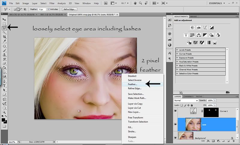
Today I’d like to talk about color casts. What are they you ask? They are the biggest THORN in my side at the moment! And the reason they are the biggest thorn in my side right now is because I can finally SEE them! Ha! And I’d also like to talk about an AWESOME new feature in CS4 called the TAT tool (Targeted Adjustment Tool), which is what helped me start to SEE color casts. Thank you Adobe…what would I do without you in my life! :O) I’ll also being going over color correcting with curves, very briefly because I still have a lot to learn in that department.

Color casts can come in many different forms. Improper white balance, shadows, shade or a reflection of something!

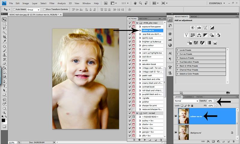
CS4 has this amazing new tool called the TAT. There are many uses for this tool depending on which adjustment layer you are using them for.

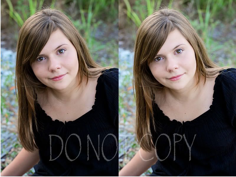
Now I know this has nothing to do with color casts or color correcting. But since I’m talking about the TAT tool, I thought I’d go over some of the other ways you can use it. My wonderful friend and photog Amanda Ward has sent me some of her shots to play with. So the next few examples are of a beautiful shot she took and I edited! Thank you Amanda…I HEART you SO!
You can use the TAT tool in a curves adjustment layer. The TAT tool looks like a little hand with the index finger pointing up that will show up in the adjustment dialog box or adjustment panel if you have CS4. How it works is you click on the TAT tool. You will see the eye drop tool. You click on where you want to lighten/darken (highlights/midtones/shadows), hold your mouse down and slide it up or down. So if your midtones are too dark, click and hold on a midtone section of your photo (usually a skin tone) and slide your mouse up a bit watching the photo. If you want your shadows deeper, click on a dark/shadow section of your image, hold down the mouse and slide it down. Watch the dialog box as you click and slide. You will see how the TAT tool reads the tone that you clicked and puts a node in the section and depending on if you slide up or down, your curve line will be up or down. Pretty cool huh?! Here I clicked the side of her neck that was in the shadows. It will then put a node on your curves dialog box where that tone is. Here is an example…


Now I love the side lighting Amanda got with this shot, so I would leave it if I were editing. But for the purpose of this tut, it’s just an example. Here is what it looks like before the TAT tool adjustment in curves and after side by side…


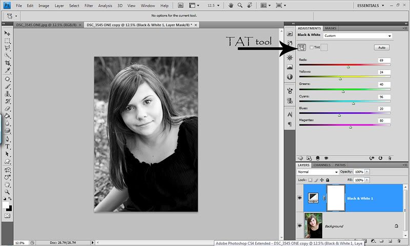
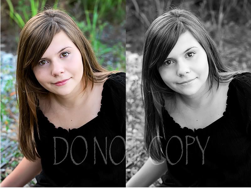
You can also use the TAT tool in a Black and White adjustment layer. I will tell that up until right now, I’ve never done it! Ha! But since I’m always about learning and sharing, I tried it. As soon as you click the Black & White adjustment layer, your image will instantly be converted to a b&w. With my 5 seconds of playing with it, you click on the TAT tool then click on an area of your shot and slide it forward or back. It will read the color of your shot (under the b&w) and adjust the tone of your b&w. I’ve never played with color mixing in b&w’s, so that’s my limited understanding so far. I still prefer a b&w gradient map for my b&w conversions. But the BEST way to learn is to just play around on a practice image. Slide the stuff around and see how it’s affecting your image. Here is a screenshot from me just clicking randomly all over the image and just sliding them around…


And the before and after side by side…


So now back to color casts…the thorn in my side! The first and best way to clean up and prevent color casts is your WB. A proper WB in camera is very important. It can mean the difference of easy editing to full blown color correcting. If you shoot in jpeg, I highly suggest learning about WB and how to set a CWB (custom white balance). For me, I shoot in RAW, so I do my WB in ACR (Adobe Camera RAW). I have a white balance card that I use in extreme bad lighting. Mostly indoor shots with lights on…like in my bathroom. All I have to do is take a pic of my card and then in ACR, use my WB picker, click on the light gray card and then make any adjustments to the sliders to taste. Then I select all, sync and choose WB in the drop down menu. No screenshots for this because this tut is more on fixing it in PS and not ACR. But it’s really important to have the best WB when bringing your images into PS, as you’ll have an easier time and the best end results.

Now even when doing everything right in camera and/or ACR, you can still have color casts. Some cameras just shoot with certain color casts in camera regardless of your WB setting. I’ve learned that my XSi shoots with a blue & cyan color cast on EVERY image…even after making proper adjustments in ACR and playing with different shooting mode and adjusting the settings of my shooting modes. If you are shooting with a lot of greenery around your subject, the skin can have a green or cyan color cast. Or yellow/red color casts in the shadows. Almost always, there are color casts in shadows. And when you shoot in shade which is a cooler color temperature, you can have a lot of blue & cyan color casts. And whites are almost always affected by color casts. My white are ALWAYS blue and/or Cyan even with proper exposure. If my shot is underexposed, then it’s really bad. And my blacks often have the same color cast, especially if shooting in shade or am overexposed. That’s also why it’s SO important to have proper exposure. You can still have color casts with proper exposure, but MUCH less. When your exposure is off, your colors will be off too. Making editing that much harder and time consuming. So always try to achieve proper WB and exposure IN camera! And really look at your photos. Look at the whites…are they true white? Look at the blacks…are they true black. Look at the shadows in your shots. Okay…enough lecturing. :O)

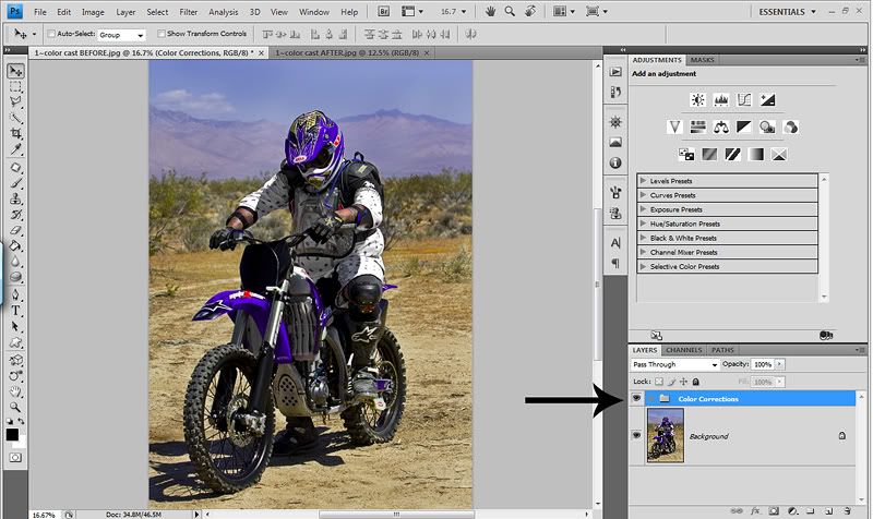
During Memorial weekend this year we went camping in the desert. This is where I really started to see the color casts. My husband and his friends had their riding gear on and where ready to go for a ride. So I took a few snaps of them before taking off and holy color casts batman! Ha! Especially for the guys wearing white gear. The reflection from their dirt bikes in the shadows on their white gear was insane. Adding my normal blue & cyan color casts…it was UGLY! THIS is where my obsession for color casts started.

So I’ll be using a shot from that weekend to demonstrate the color casts from the SOOC shots, the after and how I removed them with the AWESOME TAT tool in CS4. I am sorry for PS users that do not have CS4. This is a new tool and is not present in any other version of PS. But you can still use this tut to help you if you don’t have CS4. You will just have to select your colors manually. More on that later in this post.

Here is the before and after shot of my husband’s friend Trevor, side by side…


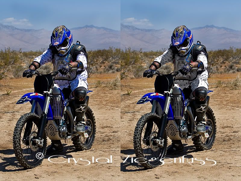
As you look at the before/after, look at the shadows of his gear & the whites on the bike that are in the shade! It’s AWFUL. I’m sure I could’ve done a better job in camera to make it a little better. But I’m just not that good yet. And I also didn’t want to blow any highlights. I did miss a few areas in the blacks, but I just did this quickly for the tut.
So what I did was pull up a Hue/Sat layer and clicked on the TAT tool. Then I clicked on the shirt in the shadows and it shows me Blue. So I pull the Blue all the way to the left removing it entirely.


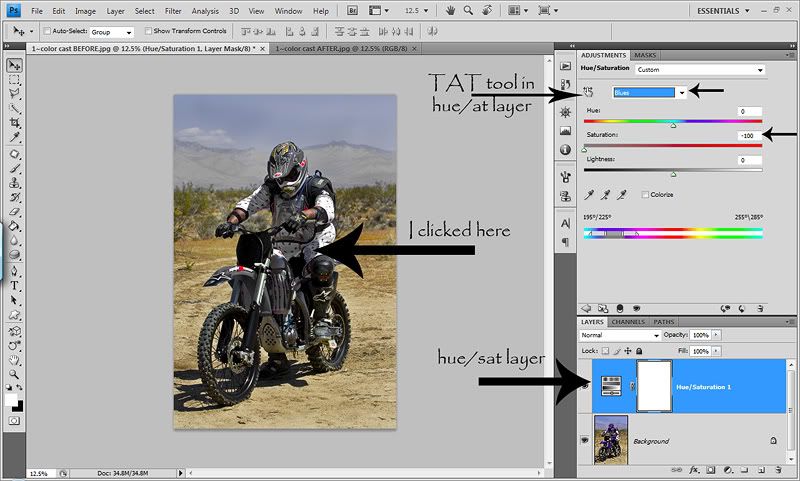
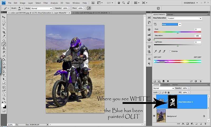
Now as you’ll see, it took the blue out of the entire shot…which I don’t want. I only want to remove the blue color cast from the shadows and in the blacks etc. So I hit ctrl/I to invert the white layer mask to black. Make sure you are ON the white layer mask first. Now the Blue shows everywhere. Now I can paint where I want to remove the blue. So I take my brush tool, soft round brush, foreground color set to white (opposite color of mask) and set my opacity to 100% because I want it GONE! Ha! Then I simply start painting on my image where I want to remove the Blue color cast.
Now I do have to be careful not to paint out blue where I want it. So I have to be careful not to remove Blue from his bike, or the drink spout hanging over his shoulder etc. What if I accidentally remove it where I don’t want it? Easy…I just switch my foreground color back to black, paint where I want the Blue back, then switch my foreground color back to white and continue removing Blue. Play with the brush opacity depending on how much of the color you want to remove. Here is what my layer looks like after painting OUT the Blue in the shadows.


After I’m done removing the Blue, I still see other color casts in the shadows. YES, there can be more than one…UGH! Are you starting to see why this is such a thorn in my side? I almost think life was more peaceful when I had horrible color casts and didn’t know it! Ha!

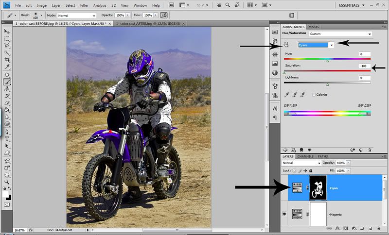
So what I’m going to do now, since my eye isn’t great at seeing all the colors yet, is pull up a new hue/sat layer. I like to name each layer for the color I remove. So on the Blue, I would name it –Blue. Now I select that TAT tool again and to start, just start clicking around in the shadows watching what color the TAT tool picks up. The next color I see is Magenta. Now because I don’t have a lot of Magenta in my image, I don’t mind pulling it all out. So on this layer I leave the mask white so that ALL the Magentas are pulled out of the entire image. I name this layer –Magenta. The best way to see where the colors are of the layer you just pulled down is to leave the mask white and toggle the layer on and off. You’ll be able to see where it’s pulling it from and that will determine if you leave the mask white and remove it from the entire image or if you will invert the mask and only remove it from certain sections.
I know I’m not done yet because I KNOW my camera will have a Cyan color cast in there too. I could just open a new hue/sat layer, select Cyan from the drop down menu and pull it all the way out and toggle the eye on and off to see where the Cyan is. But…I want to see just how smart and accurate this TAT tool is. Which of course it IS! And yes, I eventually find Cyan and pull it all the way out. But with the sky, mountains and the bike in this shot, I don’t want to pull it out everywhere. So just like the Blue hue/sat layer, I will invert the mask, and paint where I want to remove the Cyan. And I personally like to do a separate hue/sat layer for every color I work on so that I can play with layer opacity separately. Again, toggle that eye on and off with the white layer mask so you can SEE where it’s pulling from. Here is my screenshot after removing all Magenta and masking out Cyan…


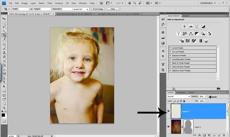
Now once I’m done removing all the color casts in my shadows with the TAT tool in various hue/sat layers, I like to create a folder and move all the color correcting layers into it. Well actually, I usually do create a folder BEFORE starting my color correction layers, but forgot for the tut. So either before you start your layers or after, hit the create a folder icon. If you do it before, all layers opened will go in this folder. If you do it after, you will have to slide each layer you want in your folder. Here’s a screenshot of mine…


Now the fun part…collapse the folder and turn it on and off! What a difference! :O)

Since I know my camera shoots with a Blue & Cyan color cast and I am becoming more aware of other color casts. I recorded a Color Correcting action and assigned a keyboard shortcut of Shift F/9. I created a folder, named it Color Correcting. Then I did a separate hue/sat layer for each color in the drop down menu. I pulled each color all the way down to zero, named the layer but then inverted the mask to black. The only color I did differently was Red. I only removed –10 and left the layer mask to white. So now when I hit Shift F/9, I have a black layer mask for every color except red. Sometimes I’ll change the red to –5 and sometimes I’ll just turn that layer off. Then I invert the Blue and Cyan because I know I need them, and I mask back in things that should be Blue/Cyan. If I see other color casts I’ll switch the mask white and toggle it on and off to check for that color. If a color layer isn’t needed, I just turn off the eye. This has saved me a LOT of time and I highly suggest recording your own action.

If you don’t have CS4, you can still use this method to train your eyes to see color casts and remove them. It’s just a few more steps. Just open a hue/sat layer and use the drop down menu. Pick any color you want to start with. Then pull the Saturation slider all the way to the left. Now turn the eye on and off for that layer. Did it help your photo? If not, slide the Saturation slider back to zero, or just type in zero. Try the next color. If it helped, name that layer. Turn it on and off and determine if you want the color removed from the whole image. If so, leave the mask white. If you only want it removed from a small section, invert the mask, and paint with white to remove it from where you want. To start until you get a better eye, try every color. After a week or two, you’ll really start to SEE the general color casts and the color cast in the shadows, whites and blacks.

This method also works great for removing yellow from teeth. Pull up a hue/sat layer, pull the yellows all the way down or half way down depending on how much you want to remove. Then invert the mask and paint with white where you want to remove the yellow. Also great for the whites of eyes. This method also helps remove some red from the eyes. But whenever you are removing red…be VERY careful. In skin tones it can go scary gray QUICK. But it can also go funky in the whites of the eyes and you have to be very careful when painting the whites of the eyes making sure not to paint on the eye lids at all. So always be aware when pulling reds!


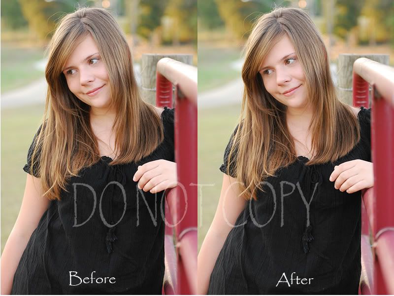
Now let’s say you want to lighten the shadows on your skin tones a bit after you color correct them. This WILL NOT remove the shadows, but will lighten them a little bit, making them less harsh! And the great thing is you are using your subjects skin tones, so it’s completely natural.

First thing you need to do is create a new blank layer. Name it whatever you’d like. I name it shadow fix. Now take your eye dropper tool and select a section of skin that is near the shadow. The goal is to select a neutral skin tone that is a bit brighter than the shadows. But not 10 shades lighter. Ha! Then once you have a skin tone sample, you will see that color is now your foreground color. Take your brush tool, soft round brush and set your opacity to about 10%. Maybe 20%. But for this method, the key is light brush strokes and going over and area several times. Rather than blasting it with a high opacity and lowering the layer opacity. It won’t blend as naturally this way.
Now start painting where you want the shadows lightened on the skin. As you paint, toggle the shadow fix layer on and off to see how it’s affecting your image. Here is what my layers panel looks like…probably pointless since you can’t see the paint on the blank layer…


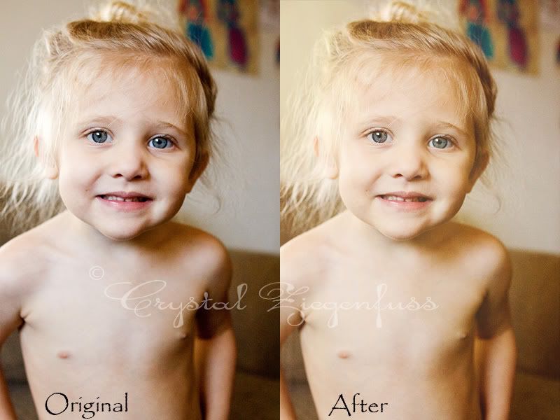
And here is the before & after side by side provided by Amanda again. Look at her neck area, chest near hair line and her right eye near her hair. It’s subtle, but the shadows are less harsh but still look natural. This also works great for shining/oily spots on skin, or evening a newborns skin tones!


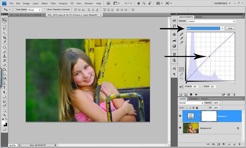
Now you can also color correct with Curves. THIS is the preferred method of the pros. But since I’m not a pro, I haven’t ventured too much into it. For now, where I am with my skill level, I prefer to work with the hue/sat layers and masking. But I will go over the BASICS of using a Curves Adjustment layer for color correcting universal color casts, from the little I’ve learned. By universal color casts, I mean the one your camera shoots with. Or an overall color cast that is effecting your whole image.
Let’s start with the GORGEOUS shot of Amanda’s daughter that she took. The first thing I see is that it’s warm and red. So I want to remove some yellow first. When color correcting with curves, you are adding a color to balance out the opposite color (hope I explained that properly) vs removing it the way I do with hue/sat layers. So knowing that I want to remove some yellow, I know to do that I have to add Blue. So in the drop down menu that is default RBG, I select Blue. Now I take the middle of the line and pull it up and out a bit watching my photo until the yellow is more subtle, but not so far the colors go too cold….


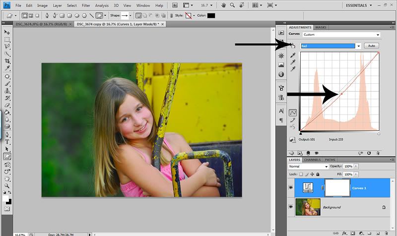
Now I also see that this shot is a bit red for my taste. So while I still have my curves adjustment open, I will now select Red from the drop down menu. The great thing is you can color correct all the colors in one layer as long as it’s a universal color cast and not a color cast in a specific area, which will require masking. I will say this is probably the best method for fixing red skin tones as it doesn’t go gray as fast like with a hue/sat layer. Just don’t go too far or you will introduce a green color cast. So I select Red in the drop down menu and pull it down & out a bit until I’m happy with it…


Now as I look at this shot, I’m seeing some green color cast in her hair. And when you remove Green in the curves drop down menu, it adds Magenta. Please don’t shoot me if any of this is a little off…I’m still learning color balance. But I’m pretty sure it’s Magenta and not Red that counter acts Green. Gosh…how embarrassing! Ha! So, I don’t want to enhance Magenta (or Red lol) in this shot. So in order to color correct her hair, I will do this in a separate curves adjustment layer so that I can do some masking. I open another curves adjustment layer and select green. I pull it down and out watching JUST her hair or wherever else I see a green color cast. Here is what I have now…


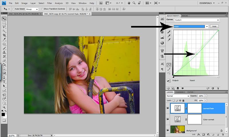
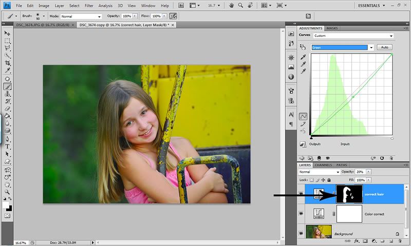
As you can see, her hair is looking less green, but YUCK on the rest of it. So just like above, I will invert the mask to black, and paint with white where I want the green color cast removed. In this case, just her hair. If I’d wanted it removed from a large section and only wanted a small section to stay, I would’ve left the mask white and painted it out of where I didn’t want it. But again, since I only want the green color correct on the hair, I want the black layer mask. Here is what it looks like after I’m done painting the hair back in. Here you have two options. Paint her hair back in at 100% opacity and lower the layer opacity, or paint with a low opacity brush until it looks good to you and leave the layer opacity. That’s a personal choice…


And here is my NEWBIE real first attempt at color correcting using Curves Adjustment layers…


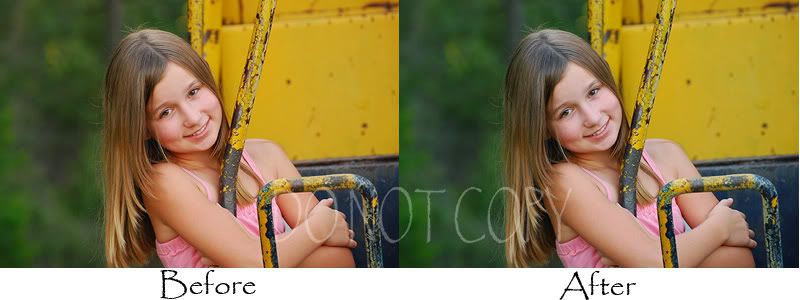
As I’m sure you can see, I still have a long way to go with this method. It just takes practice…sometimes a LOT of practice. But that’s what I love about this blog. I learn with you. It was fun doing the color corrections with curves because I don’t try it enough. So I was teaching myself a little as I was writing this and doing the screenshots.

So that’s it for today. I know…you are thinking…that’s it???? This is like 20 pages long! Ha! If you’ve been here since the beginning, you know that about me. And if you haven’t, you’ll learn that about me! :O)

So I hope this helps you to start to see the color casts in your images and gives you a starting point in HOW to see them and how to start correcting them. As with anything in PS, there are a million and one ways to do everything. So these are just two ways. And always…practice over and over and over until you get more comfortable with it. And I’ll say one last thing…WB and colors are subjective. What one person likes, another may not. I tend to prefer warmer shots & skin tones. A correct WB isn’t always the best WB. You have to discover what you like and edit to that goal! :O) Photography and editing is ALL personal preference!

If you have any questions, please feel free to ask. I will do my best to answer your questions and if I don’t know the answer…I NEED to. So I’ll do my best to find the answer…for both of us! :O)
HAPPY color correcting!

Friday, July 10, 2009

Product review....Auto Loader....


Today I would like to talk about a product I just recently purchased and am THRILLED with. This product will help speed up your workflow and allow PS to work on one image at a time. No more having several images open and slowing down PS or having it crash on you!


What this WONDERFUL product does is load each image for you one at a time in PS, automatically runs an action that you assign to it and then once you've edited and flattened the layers, closes and saves your image for you in the location you choose. Then it opens the very next file in the folder runs the action and so on.

It's SO very simple to install and easy to and use! I've only used it for a couple days and I already can't live without it. When you purchase and download the program it will come with instructions on how to install and how to assign an F key in PS. I used F5.

It works with jpegs, tiffs and psds. If you shoot in RAW, you will need to do your RAW edits in ACR and save as jpegs then load the jpegs with the Auto Loader. I shoot in RAW and don't find this simple extra step to be a problem. So I open my RAW files via Bridge which opens them in ACR. After my ACR edits are complete I select the images I want or if I will use all, I hit Select all then hit Save Image...


Then this dialog box comes up. All you need to do is assign a folder for the jpegs to be saved in. I made a folder titled jpegs IN the folder that the RAW files exist. Then you can name them and add the date etc and choose your format (I chose jpeg) and the quality you'd like the file saved as. I chose quality 10. Once I've hit saved, I click Done in ACR.


If you do not shoot in RAW, the above steps are not necessary. So now we open PS. You need to SET the Auto Loader for each new set of images you'll be working on. It VERY quick and easy. You've already set the shortcut key right after you installed it. So go to File>Automate>Auto Loader 3 SET!


Here is where you tell the Auto Loader where to pull the images from (in this case the RAW files that I converted to jpegs in their own folder). You can see the extension in the Source Folder section. I just leave all three extensions checked even though I only have jpegs. Next click on the Run an action immedately after the image is loaded. Then use the first drop down menu to select the folder, then the action that you want applied to all your images in that folder. I have an All in Once action that is set up pretty well and has the layers already adjusted. Then you need to tell the Auto Loader where to save the edits. I made another folder title PP for post processed in the same place I made my jpeg folder. However you want to do it is fine. Then finally you assign the format in which you want your edits saved and the quality. As you can see I chose jpeg quality 10. And now the Auto Loader is set to the folders you want to edit and save in. Pretty easy huh? :) Now click Save and close!


You are now ready to start editing. ALL you have to do now is hit the F key that you assigned for the Auto Loader. As I said, I chose F5. So now I just hit F5 and it will open the first image in the folder I told it to draw from. It will automatically run my All in One action so I just sit and watch and drink some coffee. It only takes a second tho! Ha! Then what I LOVE the most is all my layers are there for me to adjust. So I make any adjustments, maksing etc, then I can even run more actions which I do. After my edits on my All in One action are done, I flatten and run my Color Corrections action if needed and flatten, then run my Luminosity USM sharpen and flatten. I may eventually add these to my All in One action but for now this works for me. Then once I'm completely done with my edit I flatten and just hit F5. The Auto Loader then saves my image as a jpeg 10 and opens the next image in my folder, runs my All in One action and leaves it open for me to edit, flatten and hit F5 again. I do this until I am done with my folder. The great thing also is that if you don't finish your folder and need to leave/take a break whatever, the Auto Loader remembers what image you are on. So if you shut down PS in the middle of a folder, just open it when you are ready to finish and hit F5 again and it will start where you left off.

The time cut down by not having several images open in PS and slowing it down and not having to open and save is AMAZING! I wish I'd found out about this much sooner. My editing time is now cut down in atleast half. You don't realize how much time it takes to open and save every file. And now my CS4 is running so much faster because I only have 1 image open at a time.

So if you find that you edit a lot of photos, wheter in business or not (I am not) this product can help your GREATLY. And THE BEST PART...it's AFFORDABLE! So run out and get it right away...I PROMISE you won't regret it!!!!

And one last thing I will say is that Mike ROCKS and customer service is AWESOME! If you have any questions, I will do my best to help. I'm still very new to the product so if I'm not able to answer any questions, you can check out the website for help! :O)

HAPPY FRIDAY!

Tuesday, July 7, 2009

The Creative Mama...a MUST see..

A dear photog friend of mine, Angie Warren has a wonderful blog called The Creative Mama! It's a wonderful and beautiful blog that you should check out right away. She is also doing a 2 week photography series with inverviews with AMAZING photgraphers. Today she interviewed the AMAZING Marta Locklear. Please go to her site, you will not regret it! Her images are BREATHTAKING, full of emotion and beauty. On top of that, The Creative Mama is giving away PSCS4! So stop by, read the WONDERFUL article, check out Marta's site and Angies site and enter to win CS4! :O)

Wednesday, July 1, 2009

Let's POP the eyes...

Sorry I didn't get this posted last night. Went to dinner with the family! :O)

So first I want to share how I pop eyes by hand, then I'll talk about the action. When popping eyes, you need to be very careful. There is a fine line between eyes that sparkle and pop, and eyes that look over worked and scary. Always use a light hand when popping eyes. And something that is very important to me when working on the eyes is to keep detail. Sure, you can lighten them so they stand out, but if not done right, they lose detail. And when eyes lose detail, they look vacant, which can ruin a really great shot. The eyes are the soul of the shot, so it's important to keep detail to keep emotion.

So here is my SOOC shot (tweaks in ACR & sharpened for the web) that I'll be using for the Tut & the action set.


This is my cousin. She is beautiful and has gorgeous eyes. My SOOC shot (taken a year ago) does NOT do them justice. So my goal is to get them looking like they look IRL (in real life).

So the first thing I do (which I didn't show in the tut..sorry) is create a new folder and name it Eyes. This way all of the layers I use are in one folder. I can turn the folder on/off to see my results.

Now since we are just working on the eyes, we need to select them. For the selection here, we are only selecting the iris of the eye. So take whatever method you use to make a selection and select both eyes. I like to use the Quick Wand. Make sure that whatever selection tool you use, have it set to ADD to selection so you can select both eyes at the same time. **Quick note...if your eyes don't have the same light in each (one in shadows) you might want to work on them seperately). One you have your eyes selected, right click and choose Feather. I use 2px feather. Here's a screenshot...


Now with your selection in place, open a curves adjustment layer. We are going to use the Curves to do a basic lighten. So take the midtones section of the curves line (middle) and pull it up & out watching the eyes as you pull it. As you'll notice, the highlights section will also go up a bit! You'll see it lighten, but you'll also see you lose some detail. So now, take the shadows section of the curves line (bottom) and pull it down a tad. When you look in your layers panel, you will see a black layer mask with white where the eyes are. Basically this means the curves you just did are on the eyes (white...showing) and where you see black, the curves are hidden. I like to change the blend mode to Luminosity for my curves layers so there is no yellowing. But if you want some yellow in your eyes, leave it as is. Sorry I forgot to change the blend mode for the screenshot. Too many kids here this morning! Ha!


Now you'll see your selction is gone. But we need it back. Don't worry, you don't have to reselect the eyes. Just hold down the ctrl button and click on the black layer mask and VIOLA...your selection is back. And you don't have to re feather, because the first layer already has the feather in the selection. Now open a levels adjustment layer. This is my FAV layer for the eye pop. This is where I get a LOT of detail and depth back in the eyes. I usually only worry about the shadows & highlights for this layer. We already worked on the midtones with the curves adjustment layer. So I take the shadows slider in more than I normally would till the darks of the eyes are deep. Then I take the highlights slider in until the lights of the eyes really POP. You can leave the blend mode to Normal here. Here's my screenshot...


Now IF you want to do some sharpening to the eyes, here's how I do it WHEN I do it. Go down to the photo and and duplicate the layer and name it what you like. I named mine USM. I also slide it up into the Eyes folder. I like to sharpen the whole eye area vs just the iris. This way it looks a bit more natural rather than really sparkly sharp iris' and dull lashes. Plus it makes the whole eye area POP more this way. So take your lasso tool and loosely select the whole eye area like this. You don't have to be perfect because you can play with layer opacity and add a white layer mask to lighten/remove the sharpening where you don't want it. And right click, feather, I again use a 2px feather. Here's my selection...


Now run a USM. I like to edit hot and play with layer opacity. So I go pretty strong here. Amount 150, Radious 1.5, Threshold 3. After you hit click DON'T do anything else yet!!!!


I prefer to do Luminosity sharpen whenever I run a USM (Unsharp Mask). So RIGHT AFTER you hit okay on the USM dialog box, go to Edit>Fade Unsharp Mask and change the MODE to Luminosity. You can change the opacity here, but I prefer to do that in the layers panel.


If the sharpening went over where you didn't want it, add a white layer mask, brush tool, round soft brush, opacity at about 10%, flow 15%, foreground color set to black and paint where you want to lesson or remove the sharpening. Now play with the opacity of the layers if you'd like. I like to toggle the folder on/off to see how much it changed the eyes.

I personally rarely ever POP eye color. But if I do decide to do it, I use the Lab Color POP, add a black layer mask and paint over just the eyes at 100% brush opacity and lower the layer down to about 10-30%. The LAB color pop is in the action set! :O)

And here is my after. I went pretty light on the eyes here, but you can use stronger settings and lower opacity or mask out with a low opacity brush...


And here is the before/after side by side. A nice subtle POP.


Now let's talk about the Eye POP action set I recorded. Sadly I rarely use it, but I do think it's a pretty good action and will give you a LOT of control over all aspects of your eyes in your images. Every layer has a black layer mask attached...which means the effect of every layer is hidden. You have to paint the effect of each layer back IN. To paint in on each layer mask, first make sure you are ON the black layer mask. Just click it once and when you paint on your image, it will paint on the black layer mask. Then choose your brush tool...soft round brush, layer opacity pretty low as well with flow rate. Make sure your foreground color is set to white, and start painting. The action is recorded in a folder, so you can minimize it to do further edits, turn it on/off to see the results etc.

There are 6 actions in this set. The first is the Eye POP. Then there are color pops for different eye colors (I will admit these are just OKAY) and then one general eye pop that is the Lab Color POP. You can play with all of them to see which you prefer, or none. Ha! And again, please excuse the breaks. I recorded this a while ago and have since learned my lesson! :O)

In the Eye POP action there are 8 layers. The top photo layer is the dodge/burn layer. Probably not needed because the other layers give you full control, but I just threw it in there. The next layer from the top going down is "No Bloodshot". Basically this layer is just to remove red. Use it only on the whites of the eyes or if you have red reflections in the eyes. The next layer is "Lushes Lashes". Use this on the lashes to deepen/darken them and can also be used on makeup or eye liner. The next layer is "White whites" which you know what to do. Use a low opacity brush here!!! You don't want freaky white whites!!!!! The next layer is "Catch Lights" which will give them a bit of shine and enchance the lights of the eyes. The next layer is "Give em depth" and my FAV layer. This will pop the highlights and deepen the darks of the eyes, giving them depth and detail. The next layer is "Give em light". As you can tell, it will lighten the eyes. Don't go too far or you'll loose detail. And the last layer of this action is "Sharp eyes". For this layer (like the tut) I like to sharpen the iris and the surrounding eye area including the eye lashes. For this layer, I like to use a brush opacity of 100% then lower the opacity of the layer. But that's a personal preference.

I think the key to popping eyes with this action is to use a lower brush opacity when painting so as to not make a major change with just one layer. A light hand on all layers will combine a nice eye pop.

So looking back at the original image...here is my after using the eye pop action. I went a bit strong to show you what it's capable of. You can go even stronger (although I don't recommend it lol) or even lighter than I did...


And here is the side by side. Normally I would do more cleanup to the eyes, removing makeup spots etc. But I just did the basics for this post.


So if you'd like to download and try my Eye POP Action set, please let me know how you like it. I can't wait to hear what you think. I hope this post finds you well and I hope you and your family has a WONDERFUL & SAFE 4th of July! :O)

Search My Blog

Followers

About my PS Blog

Hi, my name is Crystal and I am addicted to Photoshop. I have PSCS4 and it's my other half. I love photography, but sometimes I think it's a means to edit!

So I thought it would be fun to have a place to post the free action sets I record, tips and tricks that I learn in PS and tuts for various different types of photo editing.

I hope you enjoy and find my PS blog helpful and if you have any questions, leave me a comment with your questions and your email address and I will get back to you!

Happy editing!

About Me

My photo
I am a stay at home to 2 great girls. My older daughter Haylee just started middle school and my younger daughter Avyree is in 1st grade! I have been married 11 years to my hubs Eric. I got my first DSLR June 31, 2008 and have been hooked ever since! My style is primarily Lifestyle! I like to take a natural and real life approach to my images! I want them to remind me of WHO my girls were when they were little, not just what they looked like. I love to edit and my editing style is always evolving and changing! I like variety and photography is a means to edit! I shoot Canon (full frame) and almost only primes. I pull out my wide angle zoom from time to time! Thanks for stopping by and I hope you like our story...
Background paper by Kay Miller

  © Blogger template 'Photoblog' by Ourblogtemplates.com 2008

Back to TOP