How I did it #2...
So while I was editing my Santa Monica Pier pics, I came across something fun and thought I'd share. It was by pure accident and yet I was so happy with the outcome. And it goes to show you what can happen when you have too much time on your hands and are click happy in PS! Ha!
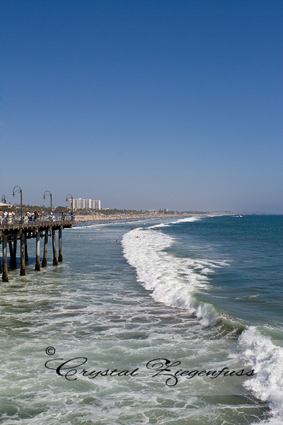
Here is the before shot that I'll be using today. Not a bad shot, but definately needs something to make it unique and stand out from the other 500 beach shots online! And as always, I HAD to find a way to make it my OWN! Something different, something that spoke to me!
And this is what I came up with using an action I'd never have thought to use to get this effect...
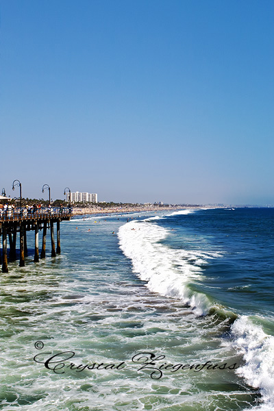
What I LOVE about this edit is what it did to the water. Sure, there are some blown parts on the caps of the waves...but I'm just not a perfectionist! Lol! I love the colors and drama and detail in the water now. And it was SO easy.
I started with my ContrastY B&W Action from my B&W conversion set! Yes, you heard correctly! Ha!
After I ran the action, I turned off the dodge/burn layer because I was feeling lazy. But feel free to dodge/burn your lil heart out! Then I turned the b&w gradient map off. I lowered the opacity of the Contrast layer to 85%, the curves layer off because it was bright enough and lowered the opacity of the Linear Dodge layer to 40%.
Here is my layers panel so far...
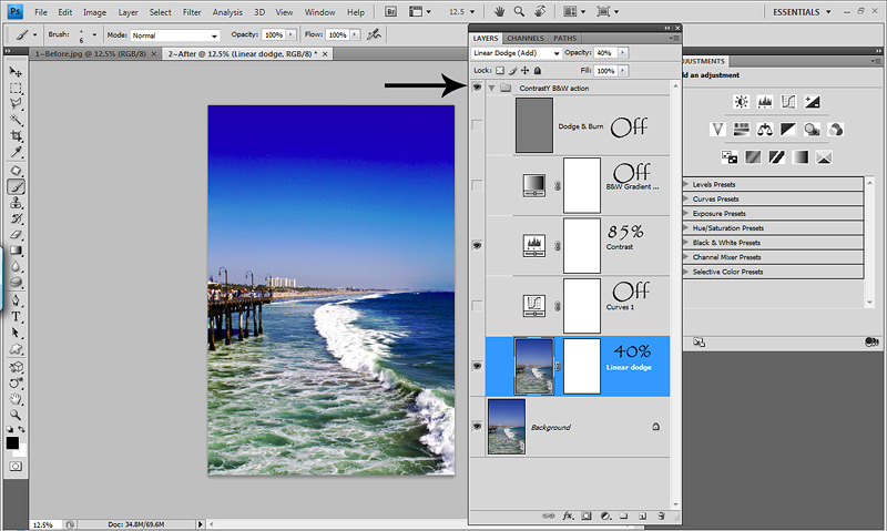
Now I wasn't thrilled with what it did to the sky. It looked wonky and over saturated and neon to me! So I flattened my layers, duplicated the layer and removed noise with my Noiseware filter to smooth out the sky. Then I flattened and duplicated again. Sorry...I do that a LOT! I then took my Rectangle Marque tool and made a selection in the bottom half of the sky. Making sure I have a decent selection of gradient from light blue to the lower white part near the water. Here's what my selection looked like...
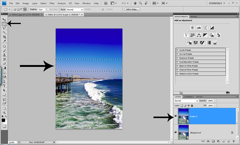
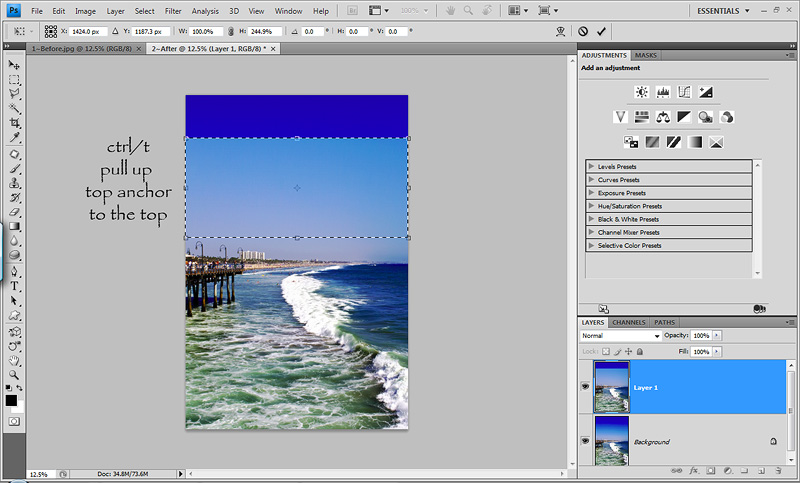
Now I hit ctrl/t for my transform tool. What I want to do is stretch the top anchor all the way to the top of the image to hide the crazy wonky sky. Here is a screenshot of it half way up...but don't worry...I went all the way up and didn't leave it there!
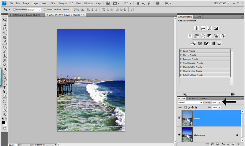
Once I have it pulled up all the way I can leave it as is. But lets say I do want a little bit of the darker blue sky to show through? Easy peasy...lower the opacity of the top photo layer. For the screen shot below, I lowered it to 50% to see what it looked like...
For me, it's still a little too much. I want more focus on the water and less on the sky. So I settled at a layer opacity of 75%. If you want more, lower the opacity, less, raise the opacity!
And here is the before after side by side...

I did try this action on other shots from this day, but wasn't nearly as happy with the end results. So this was the only image to get this treatment.
So this goes to show you that actions are really versatile and you can click and combine and turn off layers etc to make them your OWN! I encourage you to PLAY with your own techniques and actions that you may have recorded yourself and downloaded online! There is NO LIMIT to creativity!
Here is the before shot that I'll be using today. Not a bad shot, but definately needs something to make it unique and stand out from the other 500 beach shots online! And as always, I HAD to find a way to make it my OWN! Something different, something that spoke to me!

And this is what I came up with using an action I'd never have thought to use to get this effect...

What I LOVE about this edit is what it did to the water. Sure, there are some blown parts on the caps of the waves...but I'm just not a perfectionist! Lol! I love the colors and drama and detail in the water now. And it was SO easy.
I started with my ContrastY B&W Action from my B&W conversion set! Yes, you heard correctly! Ha!
After I ran the action, I turned off the dodge/burn layer because I was feeling lazy. But feel free to dodge/burn your lil heart out! Then I turned the b&w gradient map off. I lowered the opacity of the Contrast layer to 85%, the curves layer off because it was bright enough and lowered the opacity of the Linear Dodge layer to 40%.
Here is my layers panel so far...

Now I wasn't thrilled with what it did to the sky. It looked wonky and over saturated and neon to me! So I flattened my layers, duplicated the layer and removed noise with my Noiseware filter to smooth out the sky. Then I flattened and duplicated again. Sorry...I do that a LOT! I then took my Rectangle Marque tool and made a selection in the bottom half of the sky. Making sure I have a decent selection of gradient from light blue to the lower white part near the water. Here's what my selection looked like...

Now I hit ctrl/t for my transform tool. What I want to do is stretch the top anchor all the way to the top of the image to hide the crazy wonky sky. Here is a screenshot of it half way up...but don't worry...I went all the way up and didn't leave it there!

Once I have it pulled up all the way I can leave it as is. But lets say I do want a little bit of the darker blue sky to show through? Easy peasy...lower the opacity of the top photo layer. For the screen shot below, I lowered it to 50% to see what it looked like...

For me, it's still a little too much. I want more focus on the water and less on the sky. So I settled at a layer opacity of 75%. If you want more, lower the opacity, less, raise the opacity!
And here is the before after side by side...

I did try this action on other shots from this day, but wasn't nearly as happy with the end results. So this was the only image to get this treatment.
So this goes to show you that actions are really versatile and you can click and combine and turn off layers etc to make them your OWN! I encourage you to PLAY with your own techniques and actions that you may have recorded yourself and downloaded online! There is NO LIMIT to creativity!

6 comments:
Wonderful! Now I just need to remember to do this with some of mine when I have a few minutes. Thanks for sharing.
Very clever Crystal! I would have never thought to do that!! :)
I have said it before and I am sure I will say it again. YOU ROCK! Thank you for being so awesome and sharing!
Love your blog. Thanks for sharing. Met you on Clicknmom's.
good thinkin on the stretching the canvas on the sky. I've never done it within a photo before like that. Very cool. Thanks for sharing. Downloaded your actions and can't wait to play:)
I have a picture that I want to try this with and I will! I'm trying to stick with the basics, but keep getting distracted. lol
Post a Comment